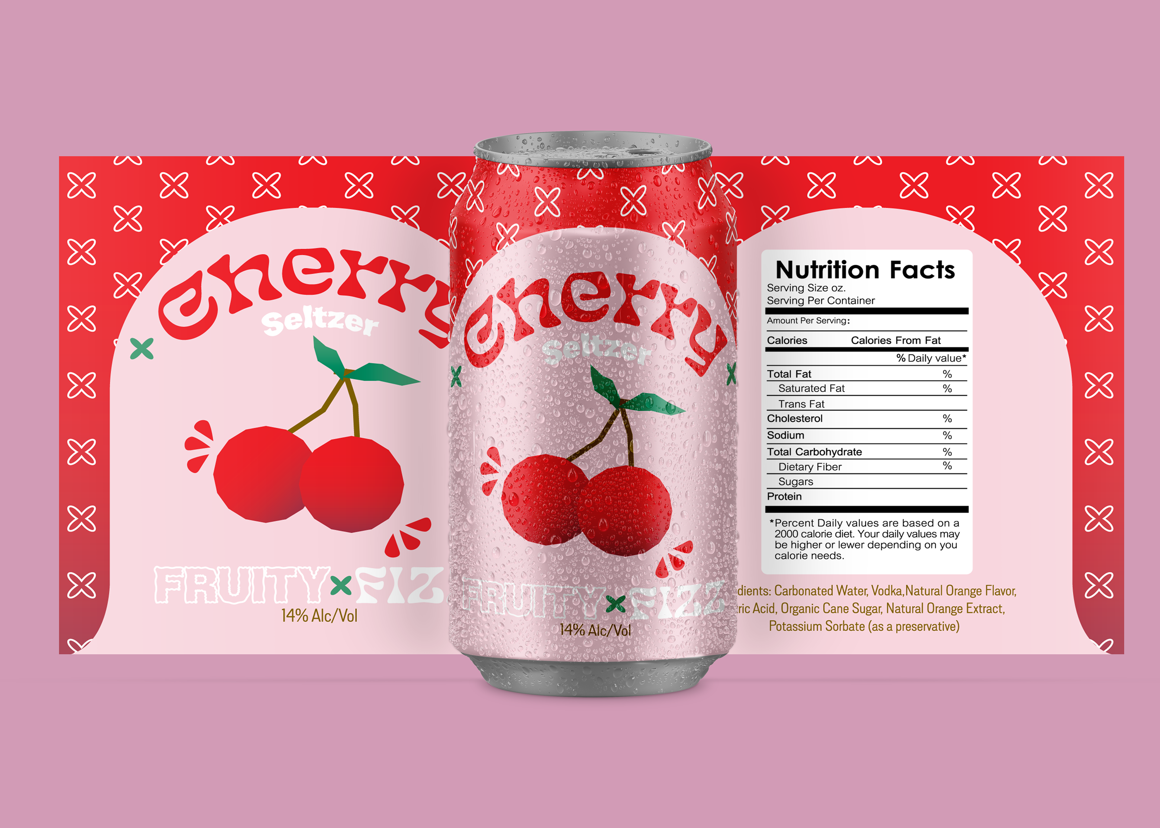
The goal behind the Fruity Fizz project was to craft packaging that served as both a visual delight and an informative resource for consumers. Initially conceived as a personal design venture, it transitioned into a project for my Integrated Design class. The core objective was to revamp or create packaging that not only showcased the product but also seamlessly integrated useful information. This meant balancing between aesthetic appeal and the inclusion of essential details. The focus was on underlining the significance of informative packaging, ensuring that consumers could make informed decisions while being visually engaged.
DESIGN PROCESS
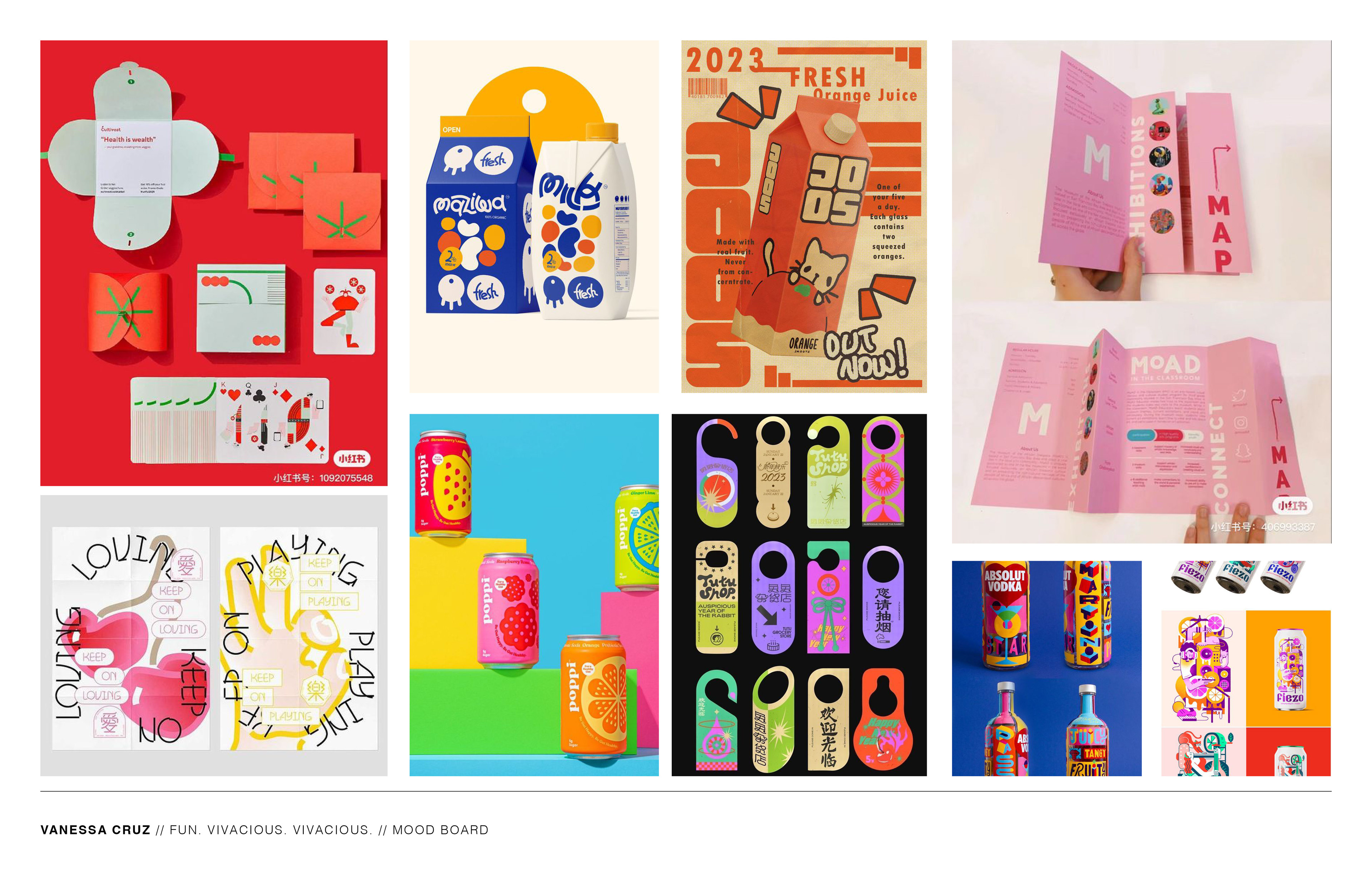
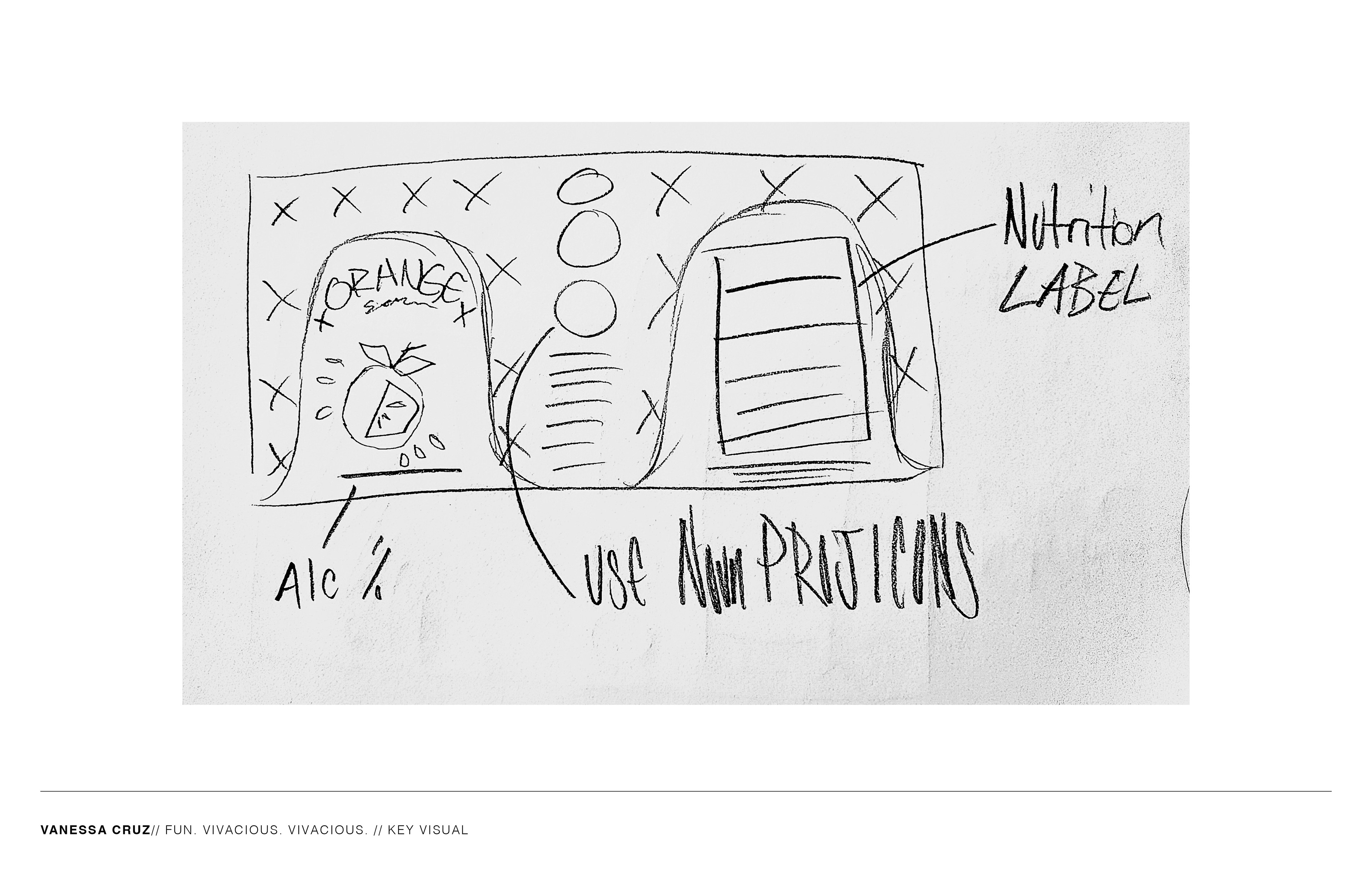
In the design process for Fruity Fizz, I aimed for simple yet colorful designs inspired by vibrant soda cans. I believe adults deserve visually appealing drinks, departing from the soulless minimalist cans of the early 2010s. The 2020s embrace a burst of color, which influenced my approach to this packaging.
DESIGN
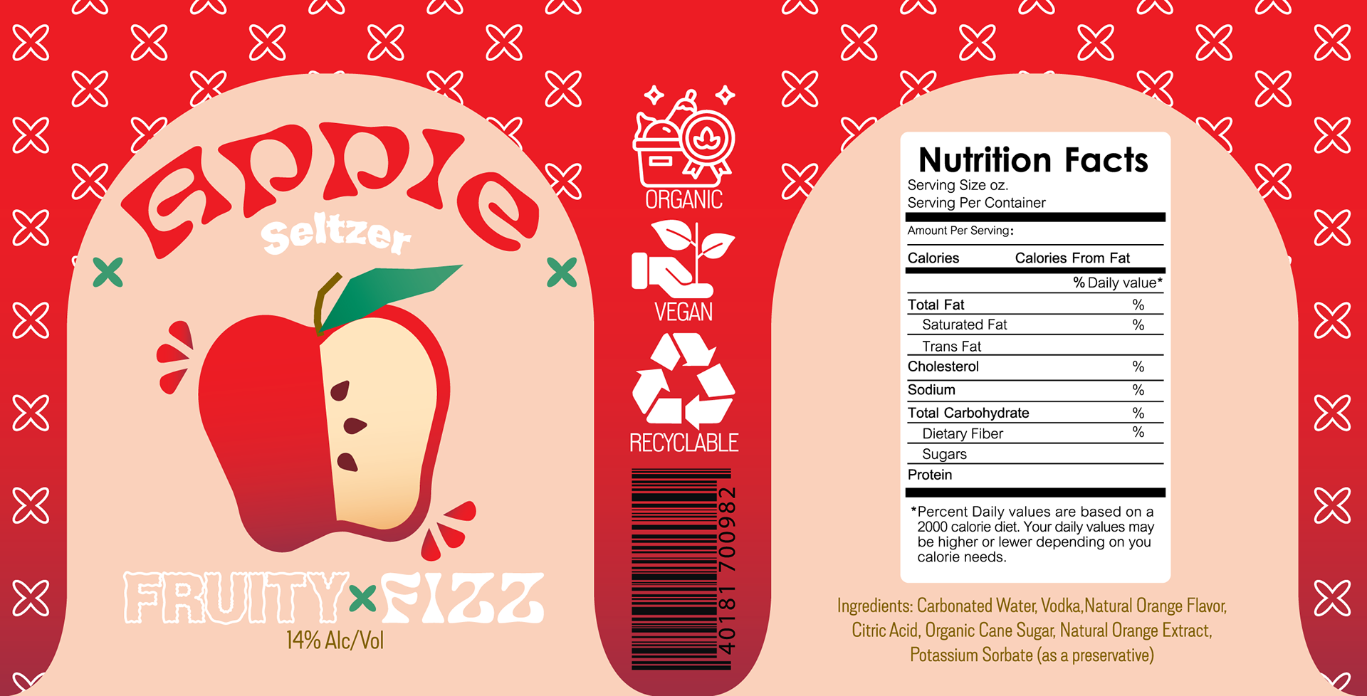
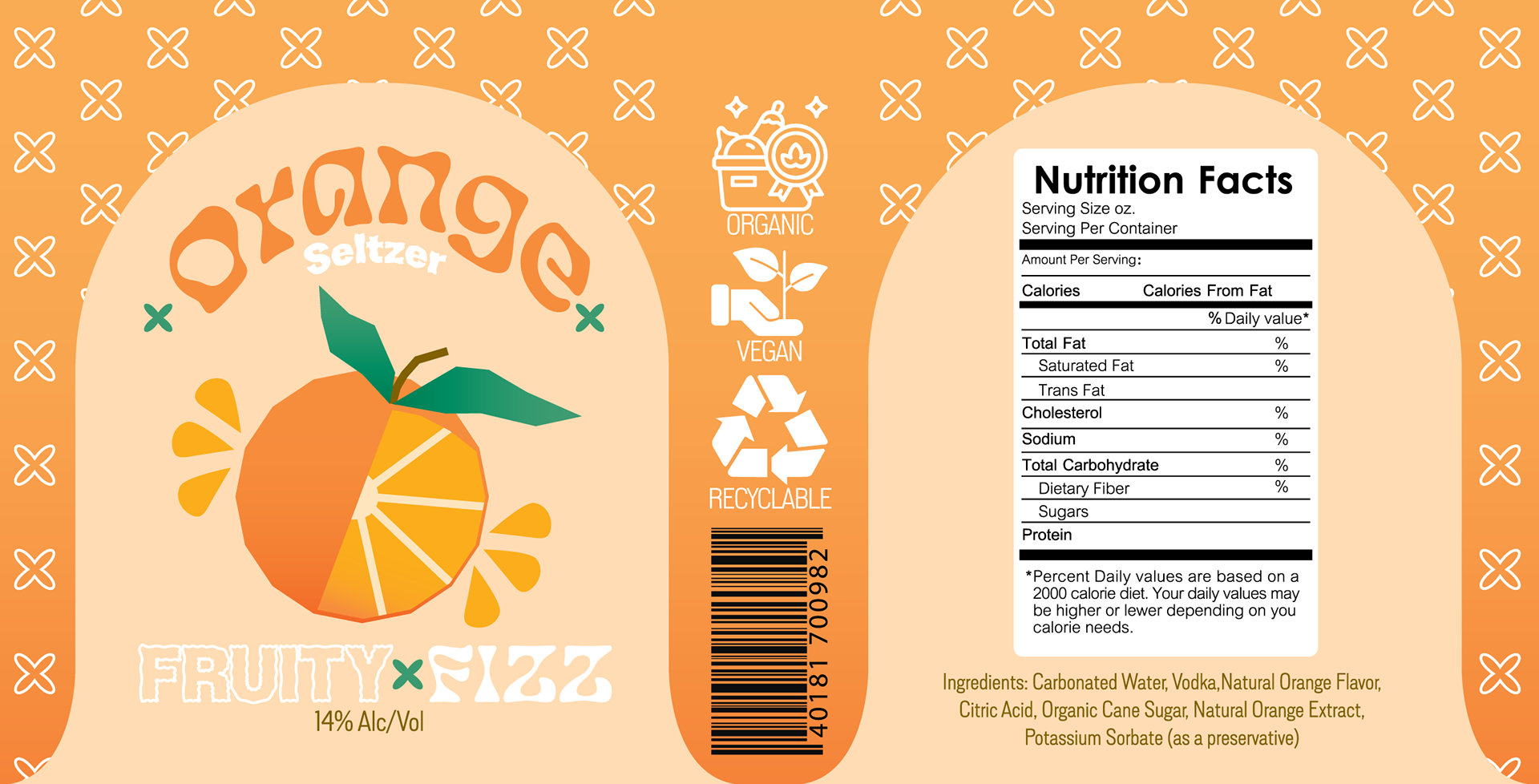
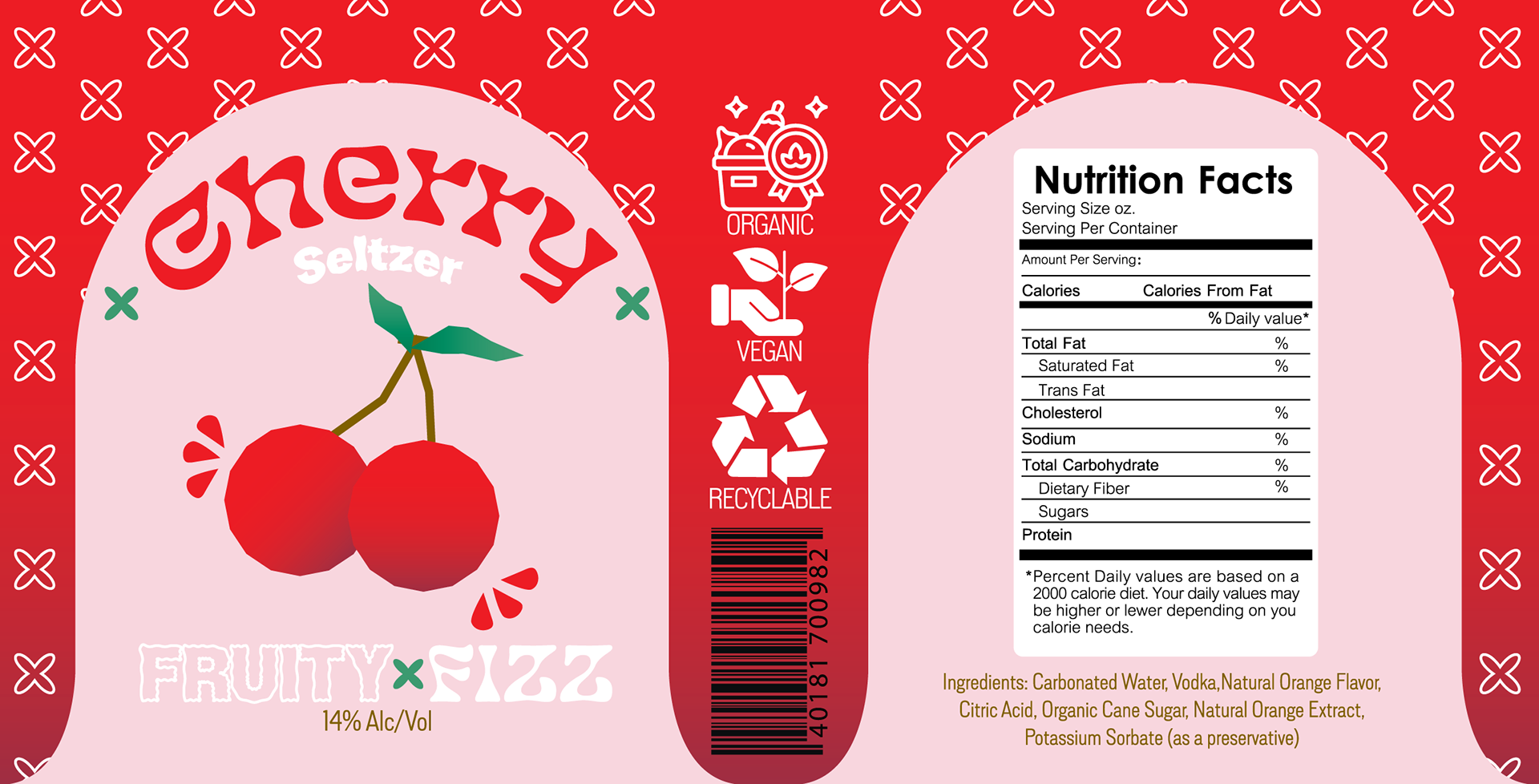
For the design, I aimed to create a youthful and attractive aesthetic tailored to young adults just entering their 21st year on this earth. My goal was to capture the essence of Gen Z, making the packaging feel vibrant and dynamic. I wanted it to exude an inviting and welcoming vibe, while also reflecting the bold flavors and alcohol content within.
DESIGN USAGE
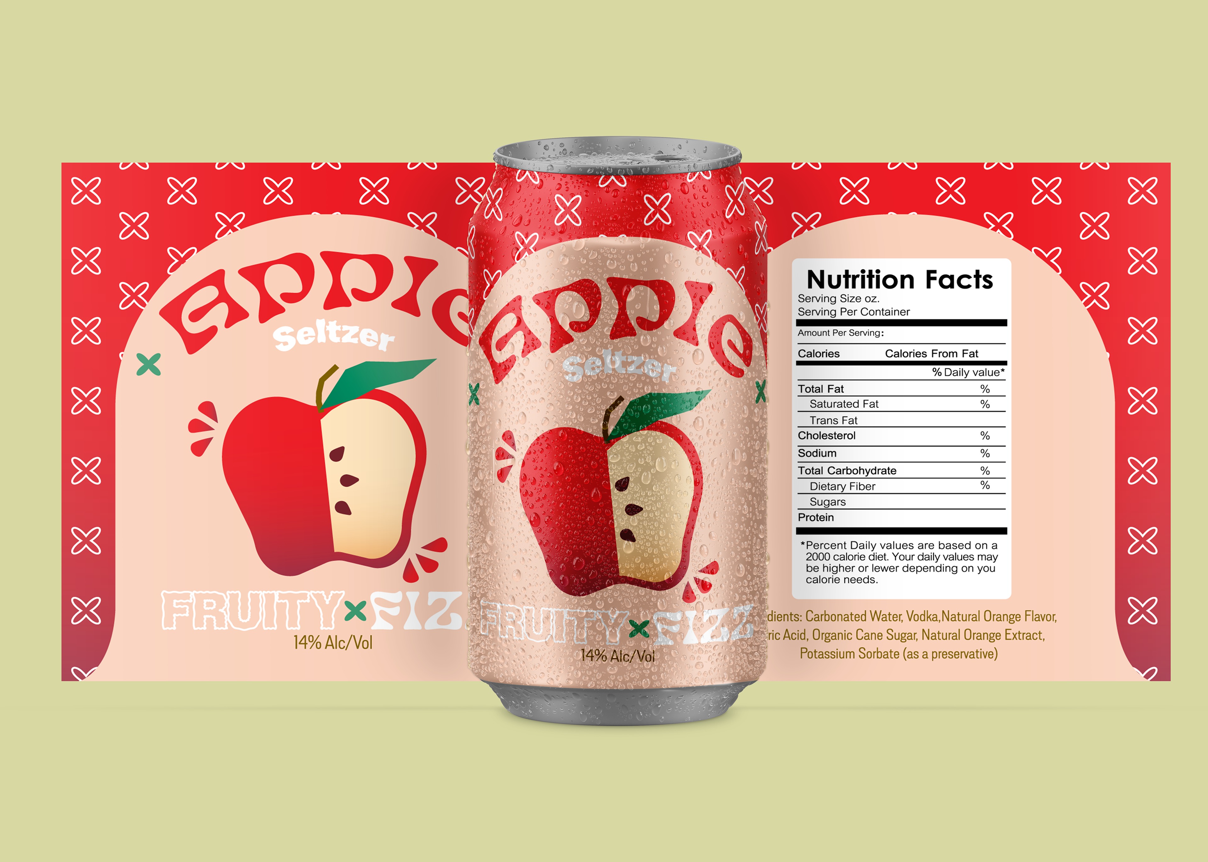
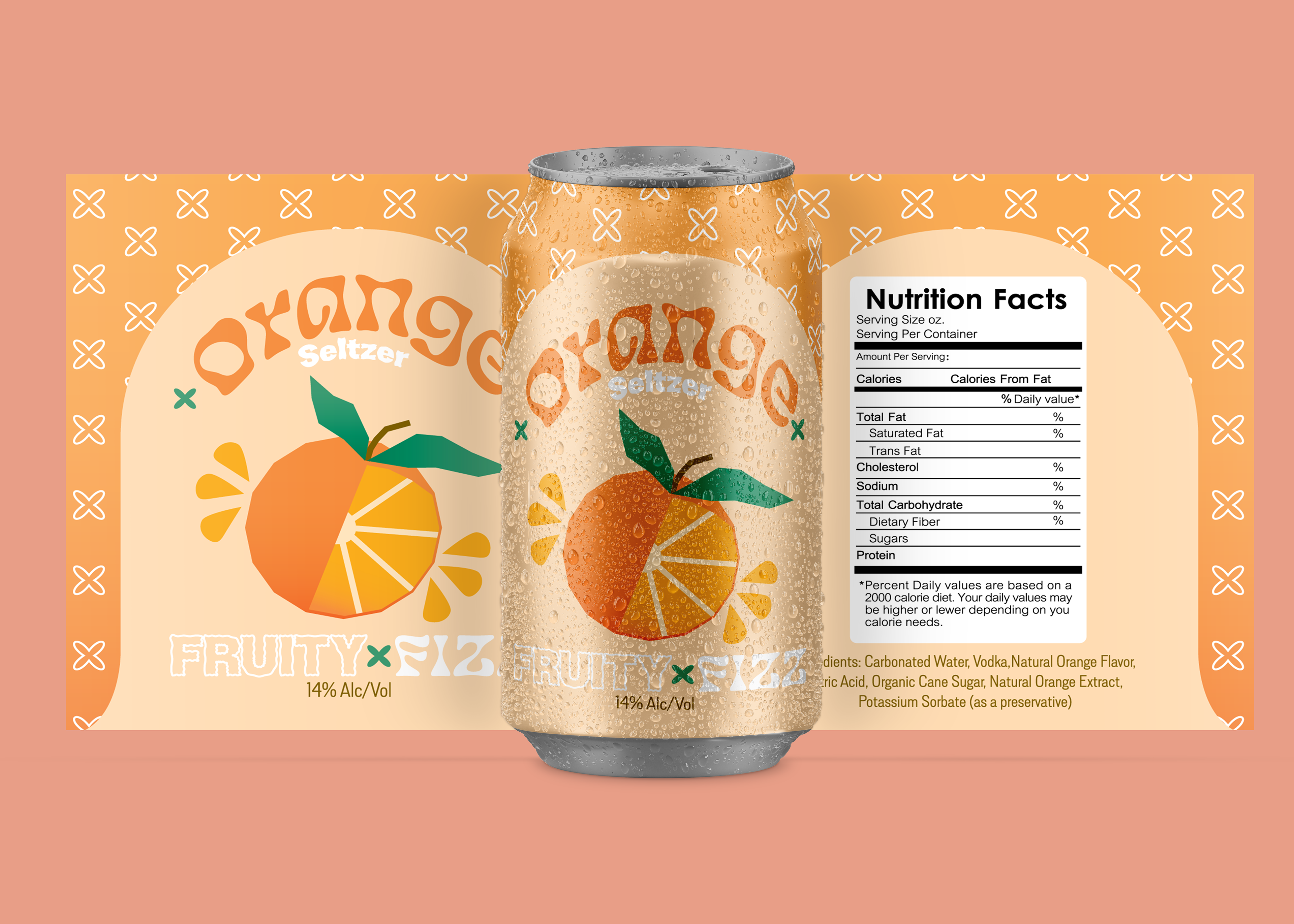
PROGRAMS USED
