The HI-TREKK app project was part of my Integrated Design class, where I developed a lifestyle app from scratch "sponsored" by Gatorade. Similar to popular platforms like My Fitness Pal or Apple Health, HI-TREKK aimed to enhance users' daily routines with features for fitness tracking, hydration monitoring, and nutritional guidance. In addition to designing the app interface, I created a marketing campaign to promote its features to potential users
DESIGN PROCESS
The mood board for the HI-TREKK app drew inspiration from a blend of minimalist aesthetics and futuristic design elements. Influenced by the simplicity of Apple and Samsung's layout and its minimalist style, I aimed for a clean and familiar interface. However, I also wanted to infuse the design with gradients and subtle pops of color to evoke a sense of modernity and energy. Drawing inspiration from simple Swedish design principles, I carefully considered the choice of fonts and visual elements to ensure a cohesive and visually appealing user experience.
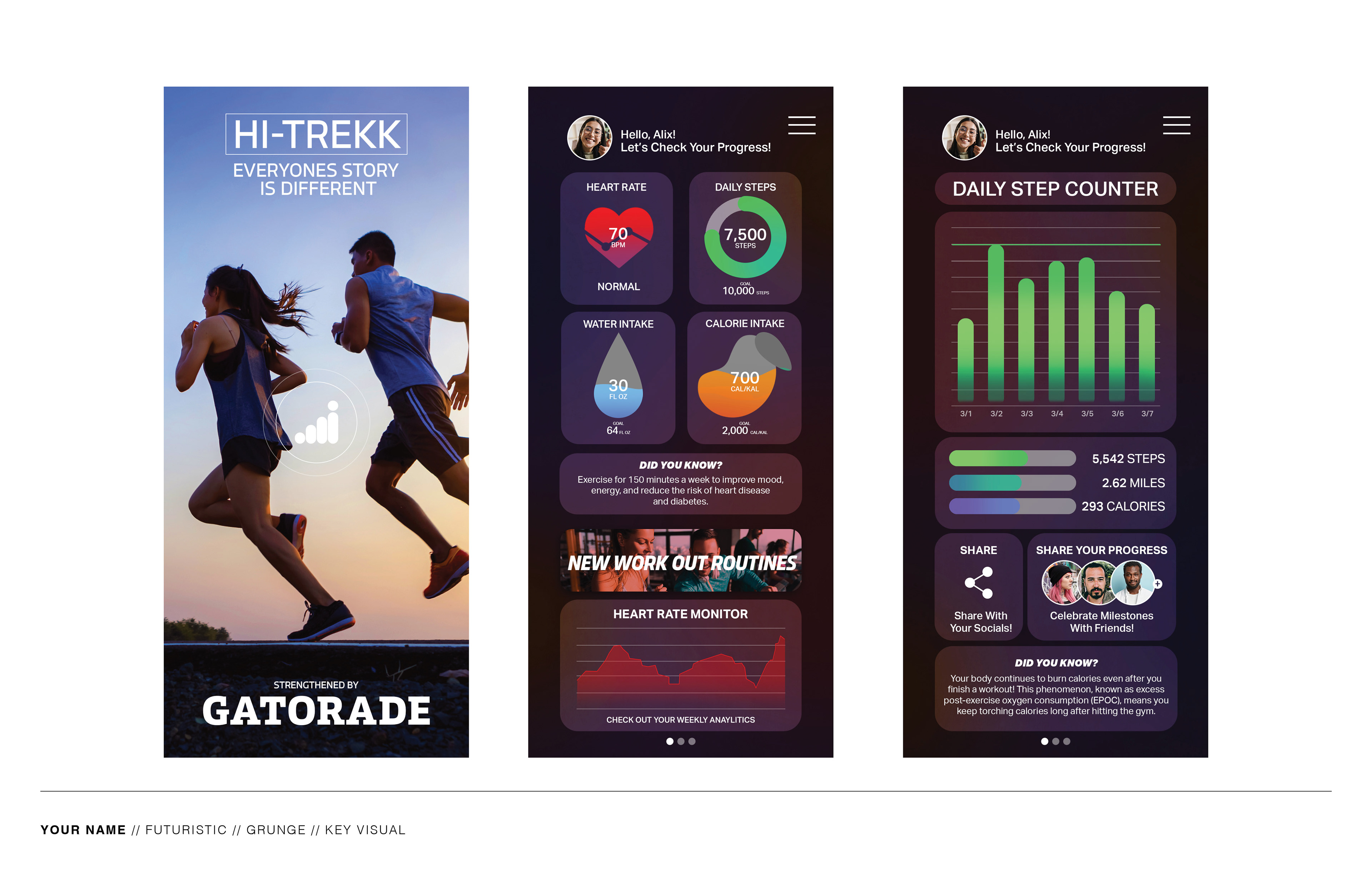
The in-app screens for HI-TREKK were designed with a focus on user-friendly functionality and accessibility. I incorporated familiar layouts, such as placing the profile photo and name in predictable spots, to enhance usability. However, I introduced a twist by integrating big buttons with images to shake up the minimalist design and add a more humanistic touch. This approach aimed to strike a balance between familiarity and innovation, ensuring that users could navigate the app effortlessly while also feeling engaged and connected to the interface.
DESIGN USAGE

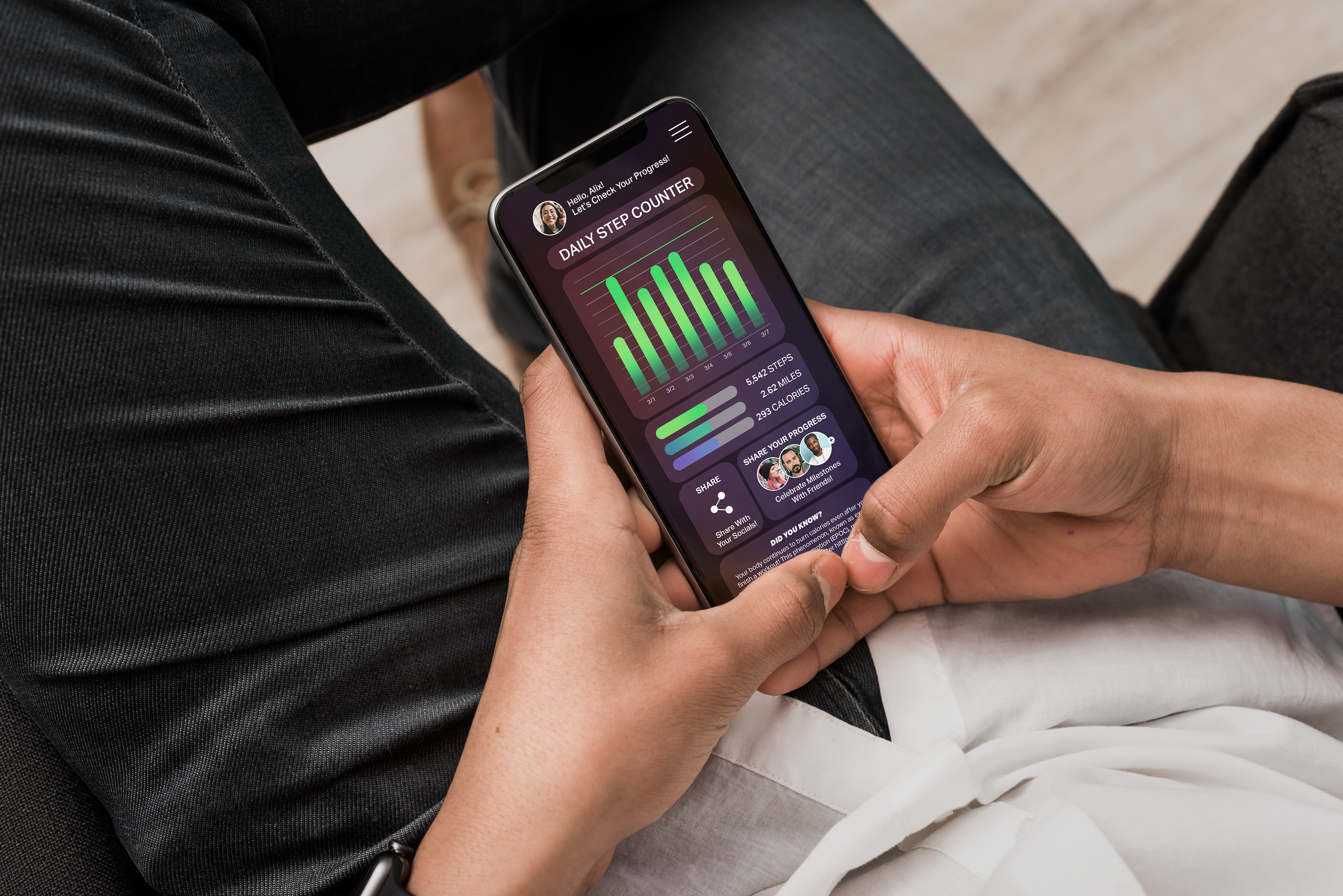
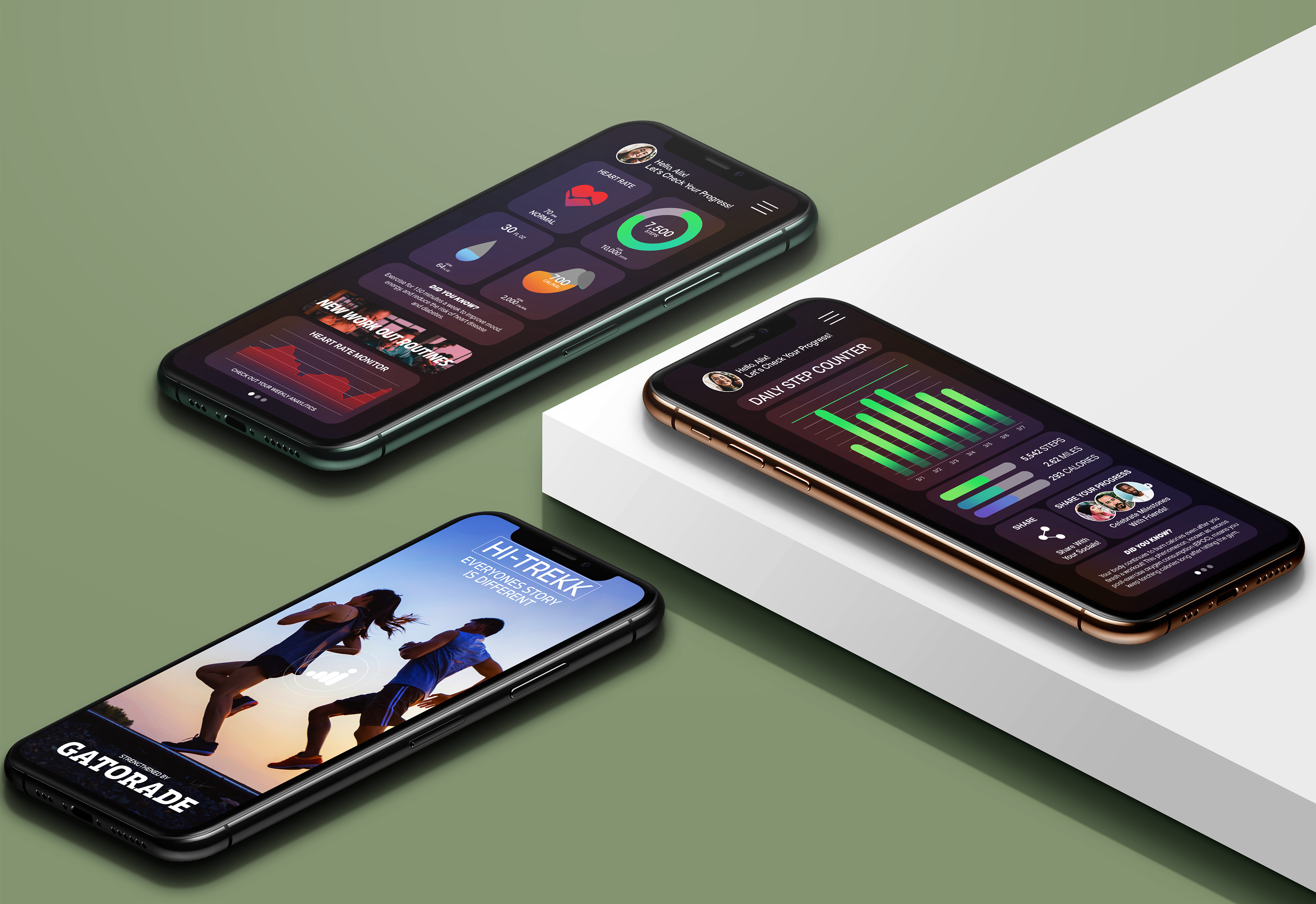
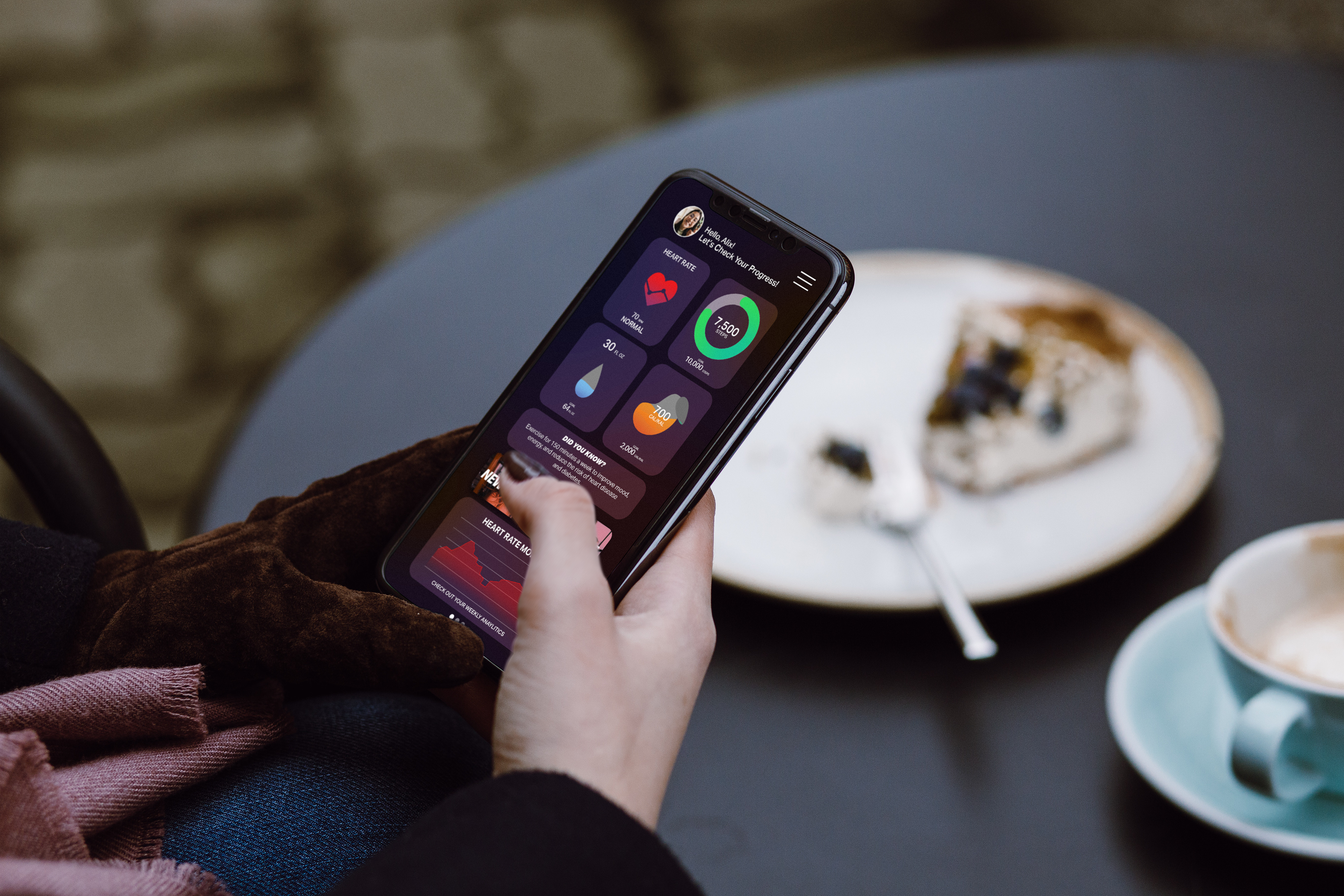
For the in-use screens, my goal was to create a realistic experience that mimicked the feel of an actual app. I paid close attention to current phone displays and their dimensions during the design process. By considering real-world constraints, such as screen size and resolution, I ensured that the app would seamlessly integrate with users' devices. This approach aimed to provide a genuine and immersive experience, enhancing user engagement and usability.
ADVERTISEMENT
DESIGN PROCESS
DESIGN PROCESS
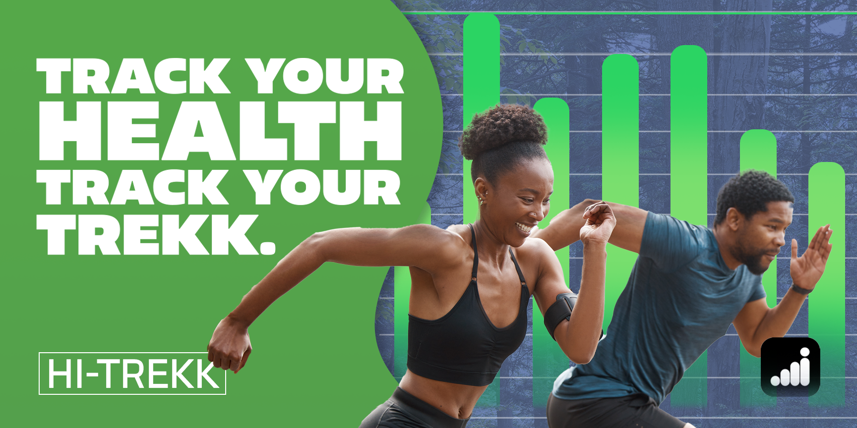
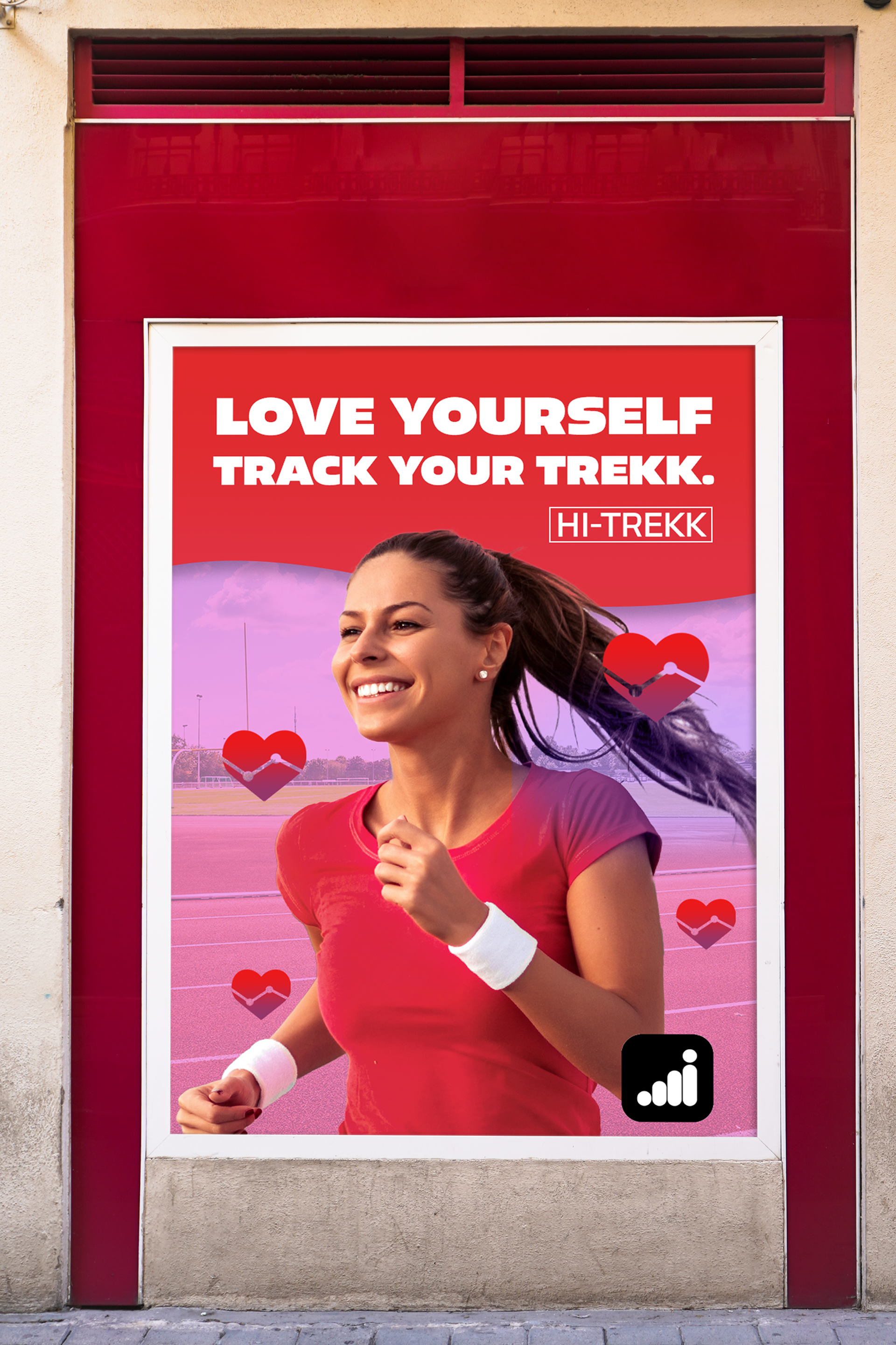
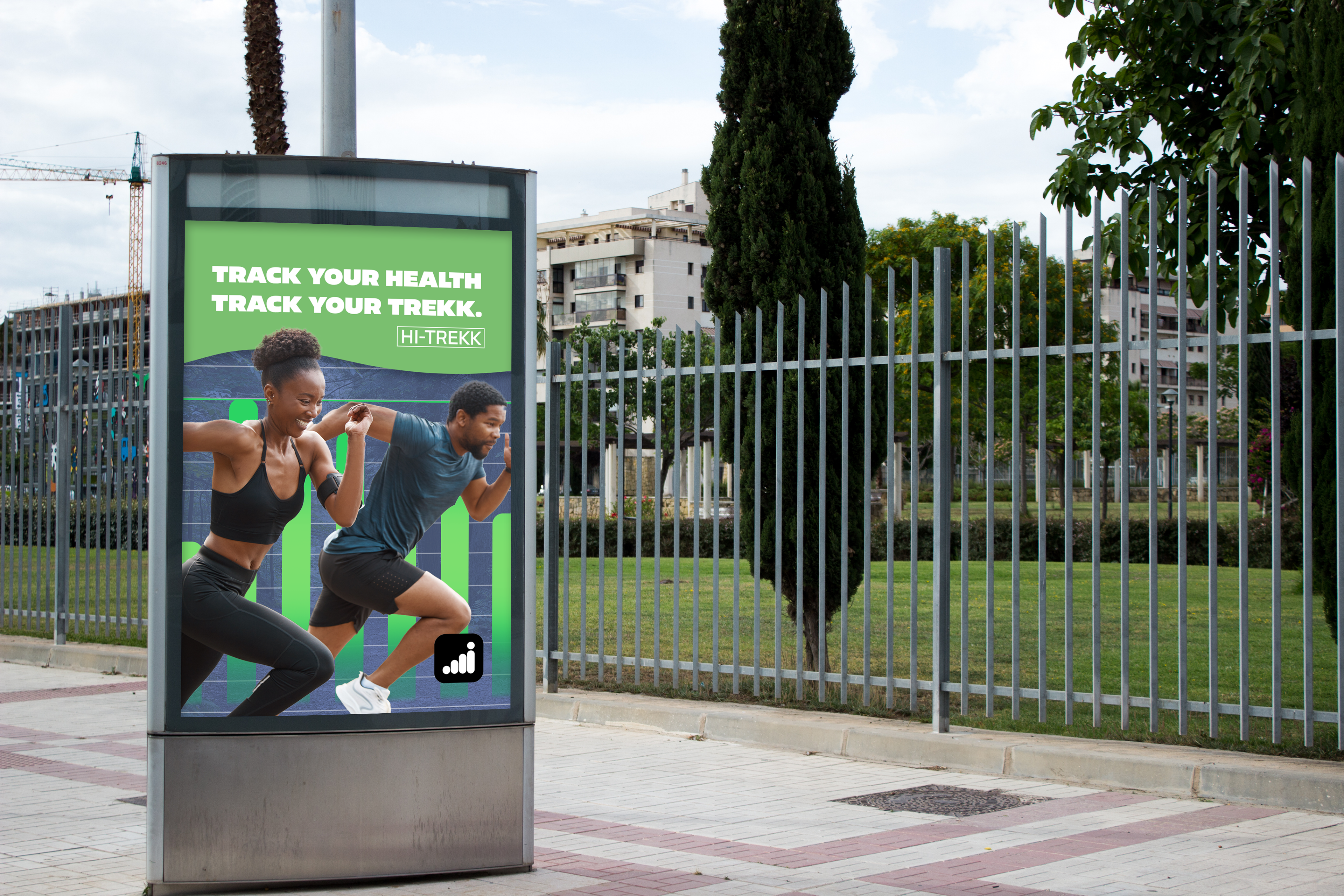
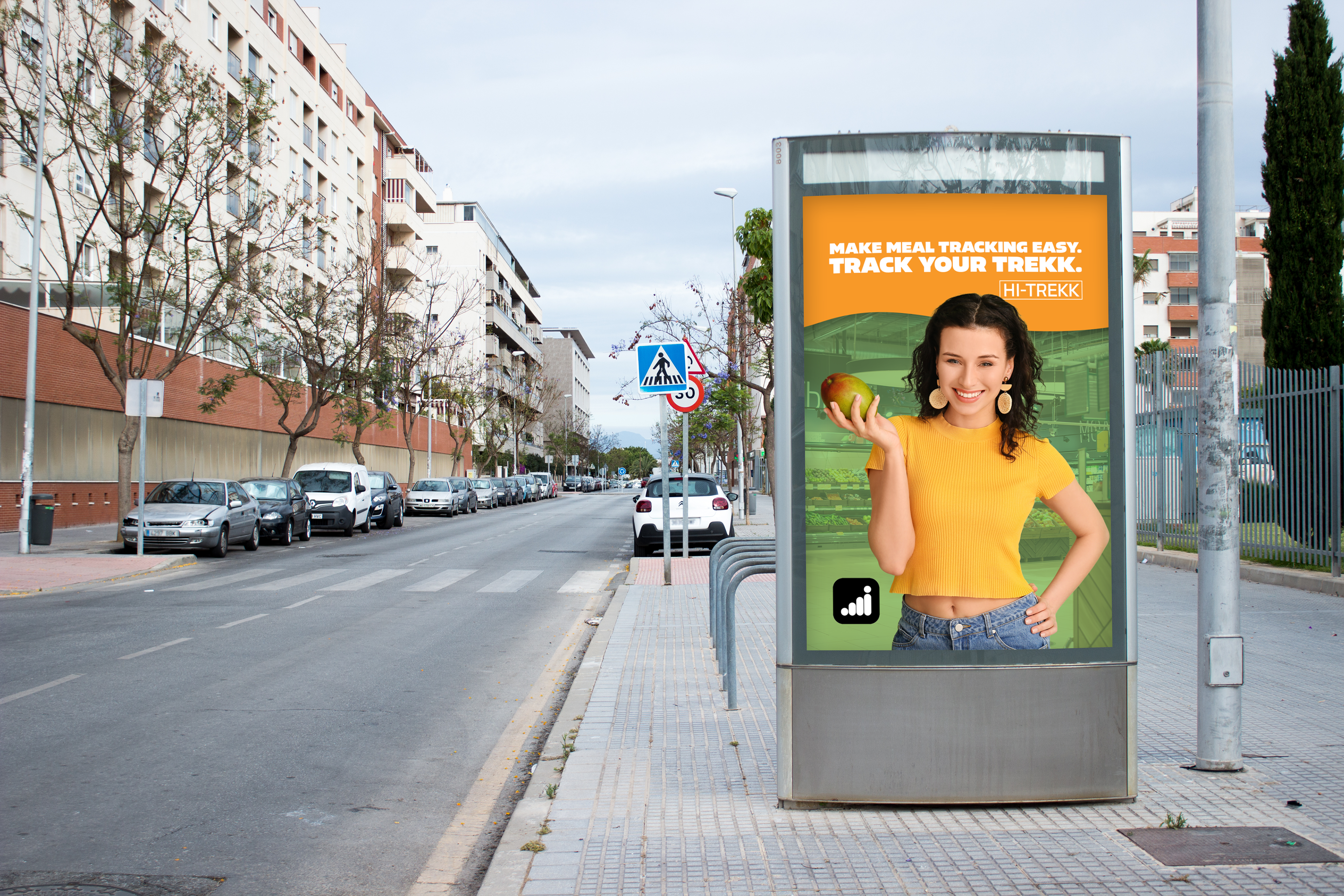
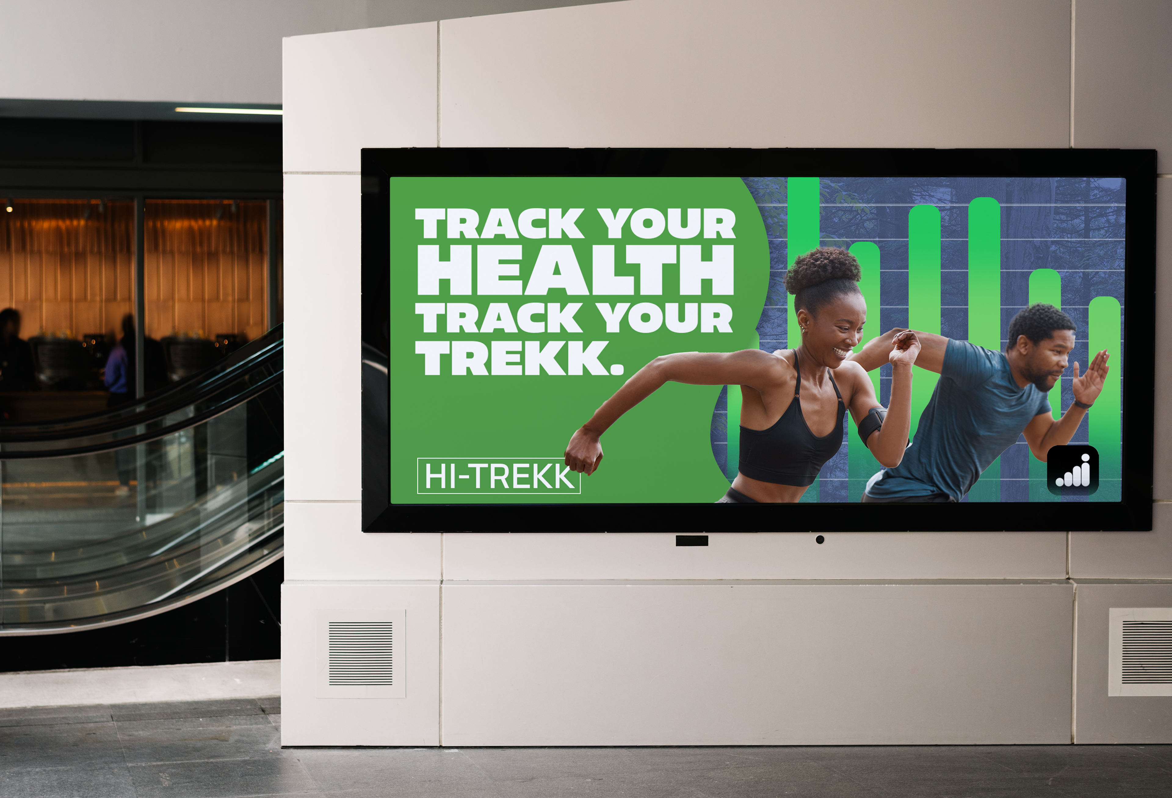
For the marketing aspect of the HI-TREKK project, the goal was to create ads promoting the app's features. I chose a humanist approach, blending in-app elements with images of people to inspire users to improve themselves. By integrating app features with human experiences, the ads aimed to emotionally connect with viewers and showcase the app's potential impact. This approach aimed to empower and motivate viewers, driving interest in the HI-TREKK app.
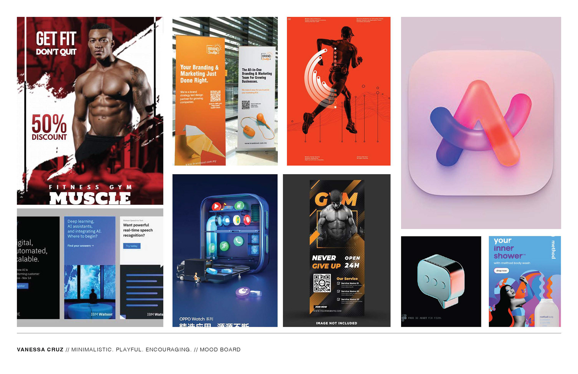
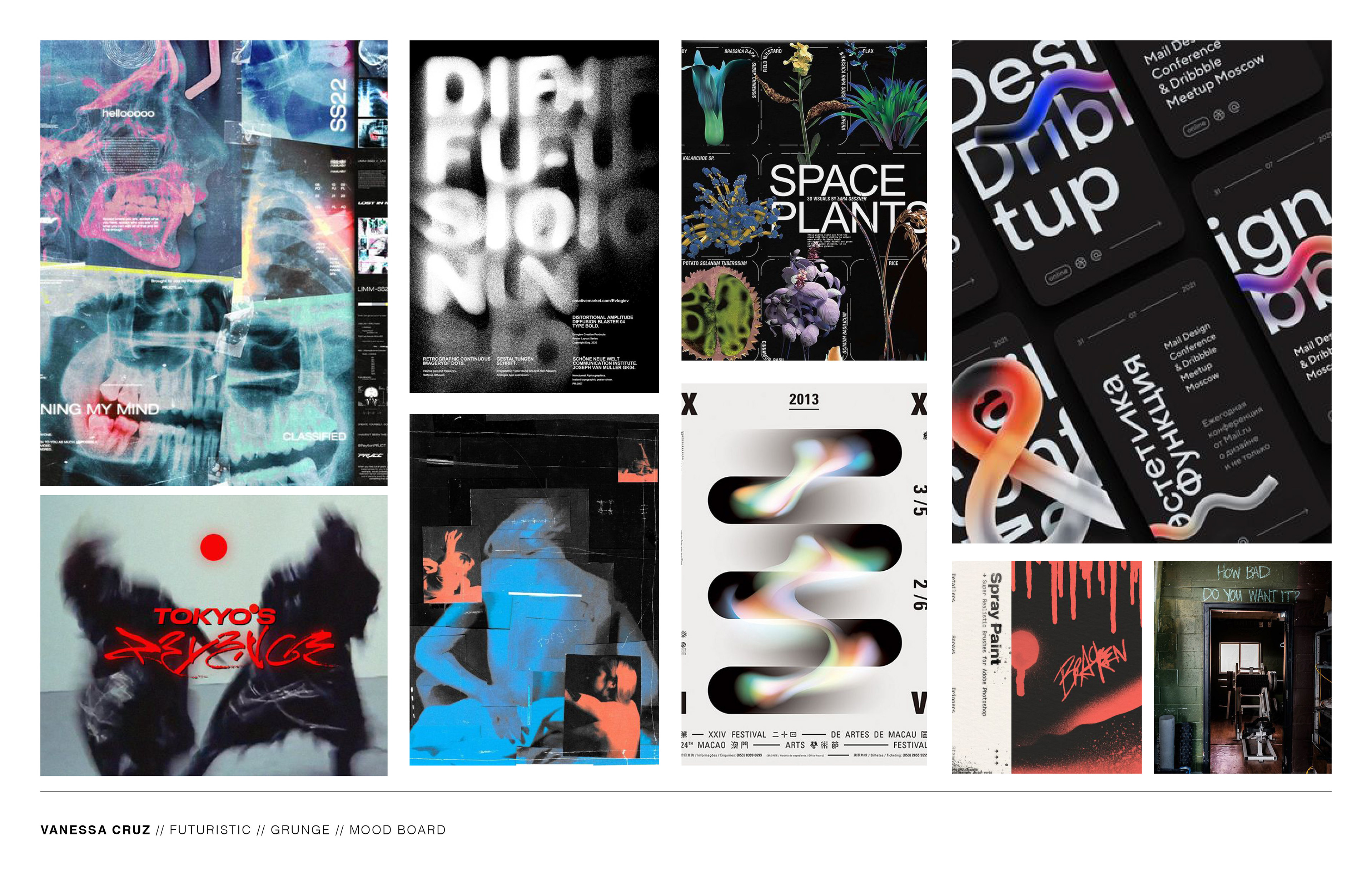
The mood board for the marketing aspect of the HI-TREKK project featured a blend of photos and graphics, inspired by the idea of merging in-app elements with real-life human experiences. This approach aimed to create a sense of human connection and encourage viewers to envision themselves using the app in their daily lives. By combining visuals of people engaging with the app's features alongside graphical elements, the mood board sought to evoke a sense of realism and relatability, inviting viewers to see themselves as part of the HI-TREKK community.
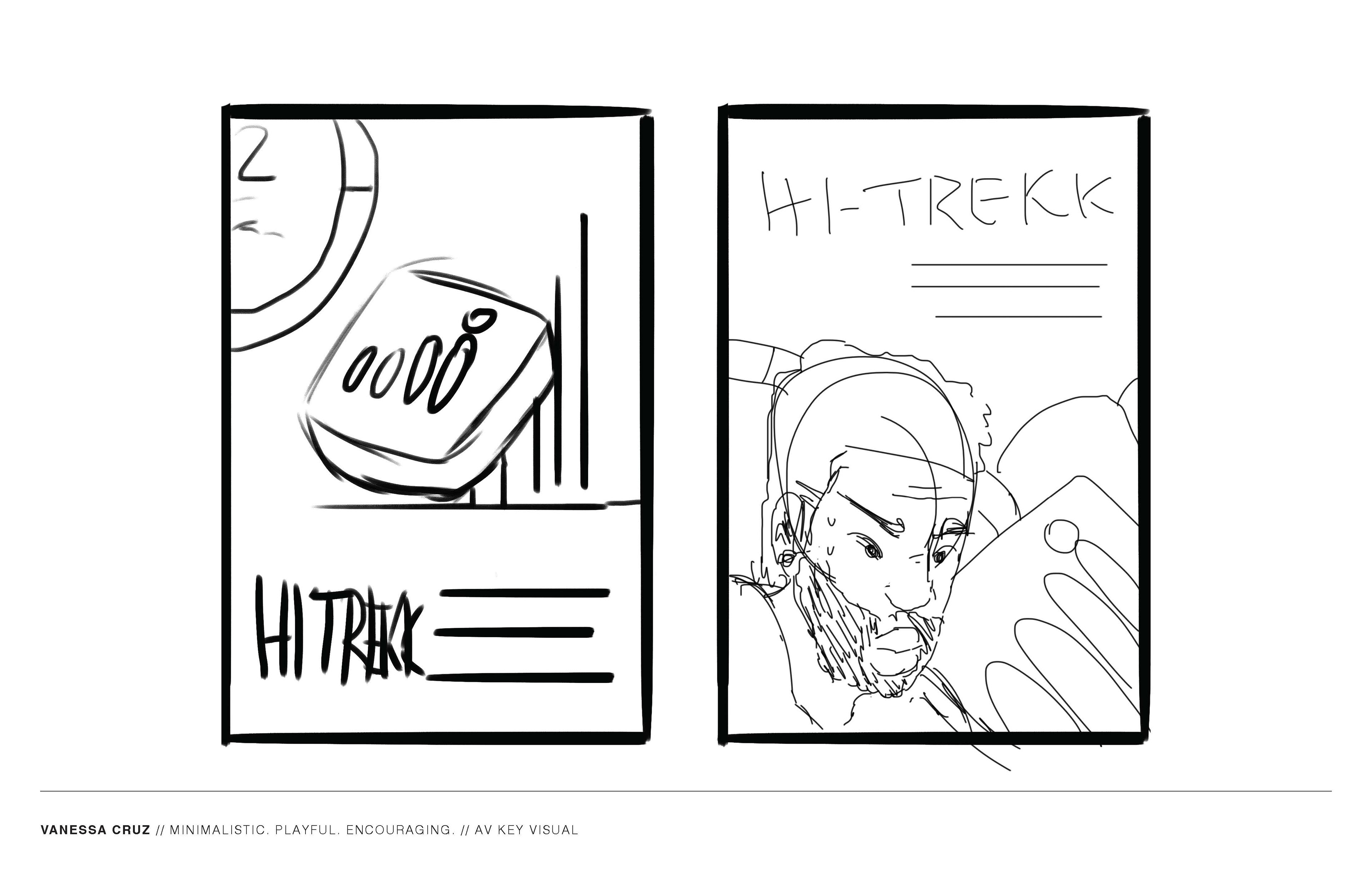
The sketches acted as temporary placeholders, providing a foundation for experimentation with different elements. While the final design closely resembled the initial sketches, it underwent significant refinement to maintain the original concept. This process allowed for exploration of various elements, resulting in a design that stayed true to the initial vision while incorporating necessary adjustments for functionality and aesthetics.
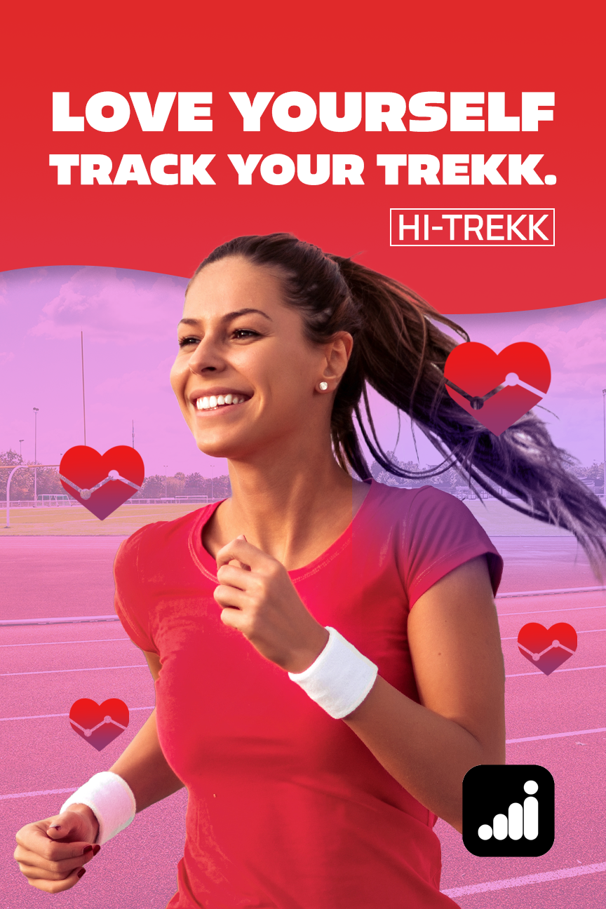
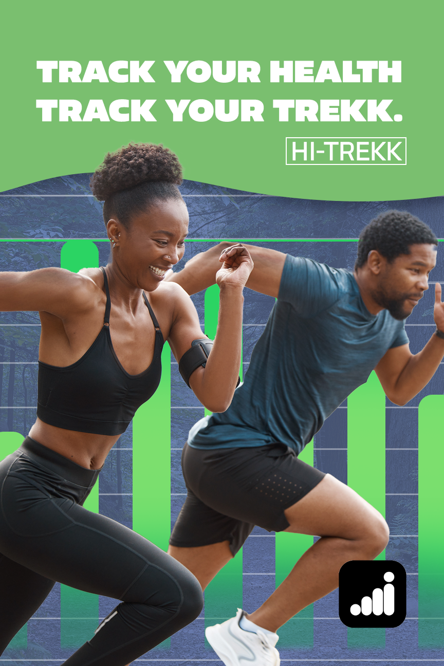
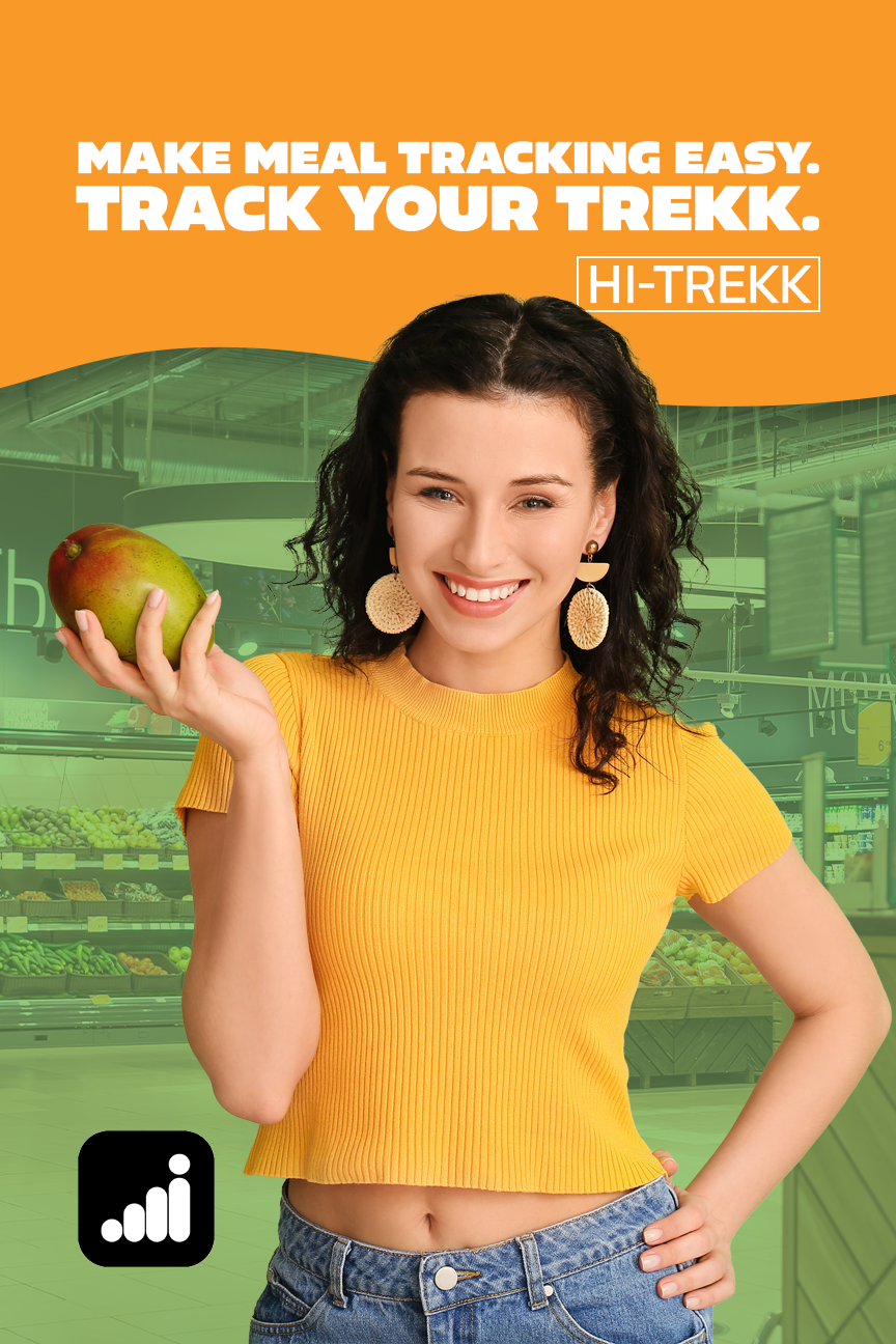
The designs were created with the intention of being seen at bus stops or on posters, offering inspiration during daily commutes. Targeting everyday people, the goal was to craft relatable visuals that resonated with the audience's experiences. By keeping the designs simple yet impactful, the aim was to capture commuters' attention and encourage them to engage with the HI-TREKK app for improving their daily routines.
DESIGN USAGE
PROGRAMS USED