
The IKEA Food Icon Project was a key assignment in my Design Principles class during my first year at Madison College. The objective was to create icons for an existing company that seamlessly integrated with their brand identity. My task was to design icons for IKEA's food section, ensuring they felt authentic and functional across different sizes and contexts. This project challenged me to maintain the essence of IKEA's design while creating icons that were versatile and usable in various situations.
DESIGN PROCESS

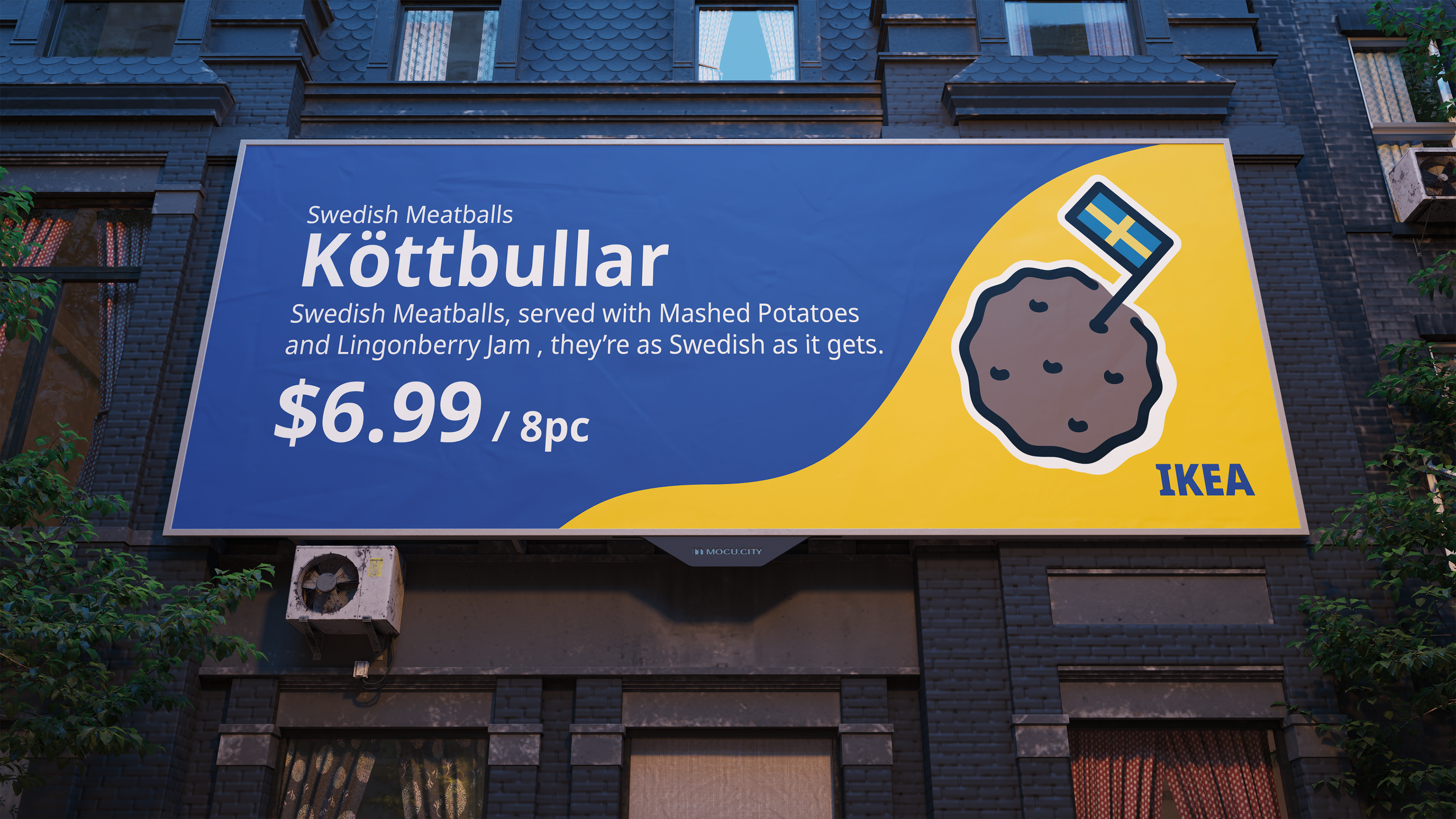
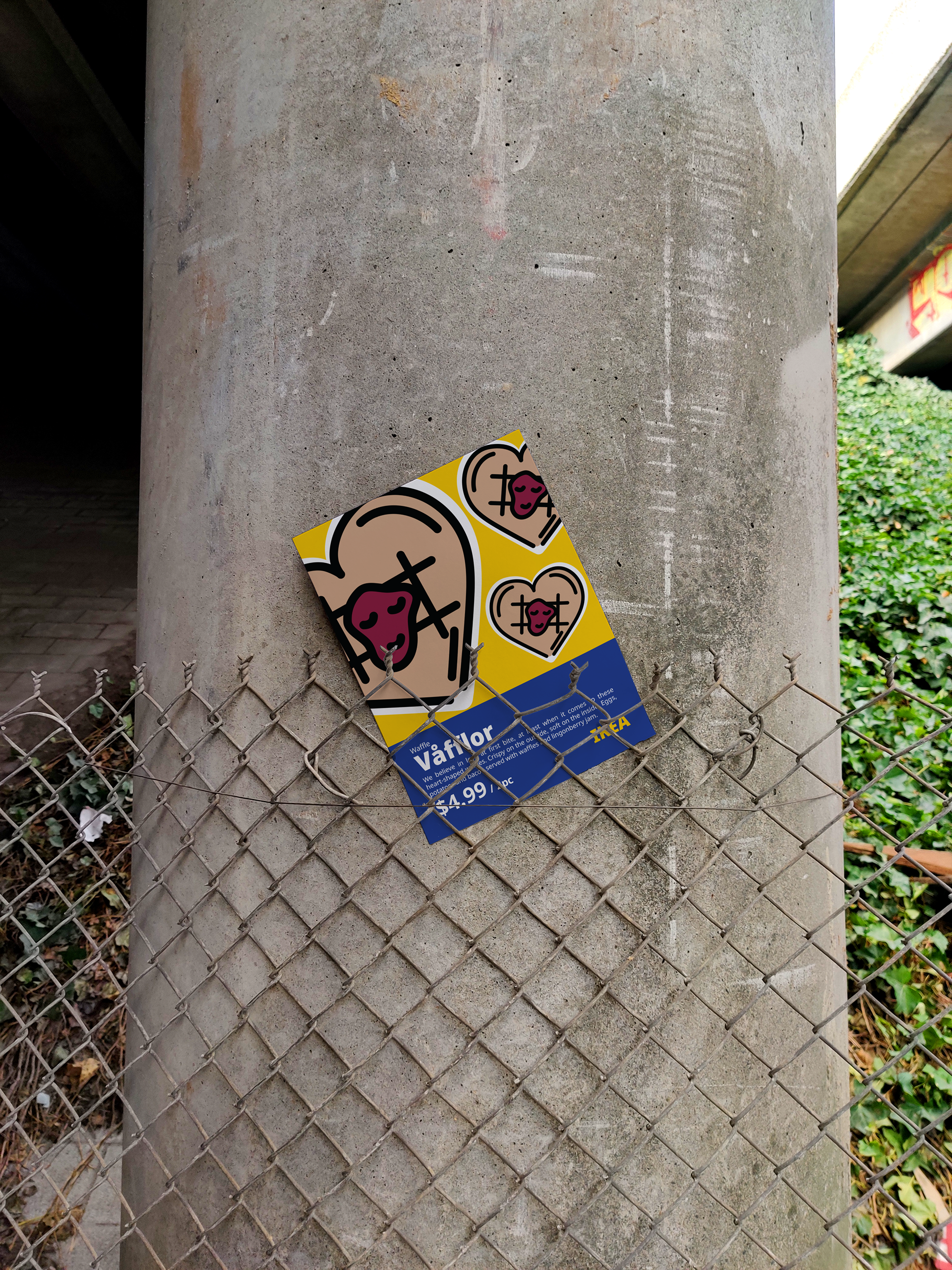
For the IKEA Food Icon Project, I drew inspiration from the food section itself, ultimately choosing to highlight iconic offerings such as the meatball. To maintain consistency with IKEA's brand, I incorporated elements from the Swedish flag, echoing the design cues found in the IKEA logo. This approach ensured that the icons not only represented the food options accurately but also remained in harmony with IKEA's overall visual identity.
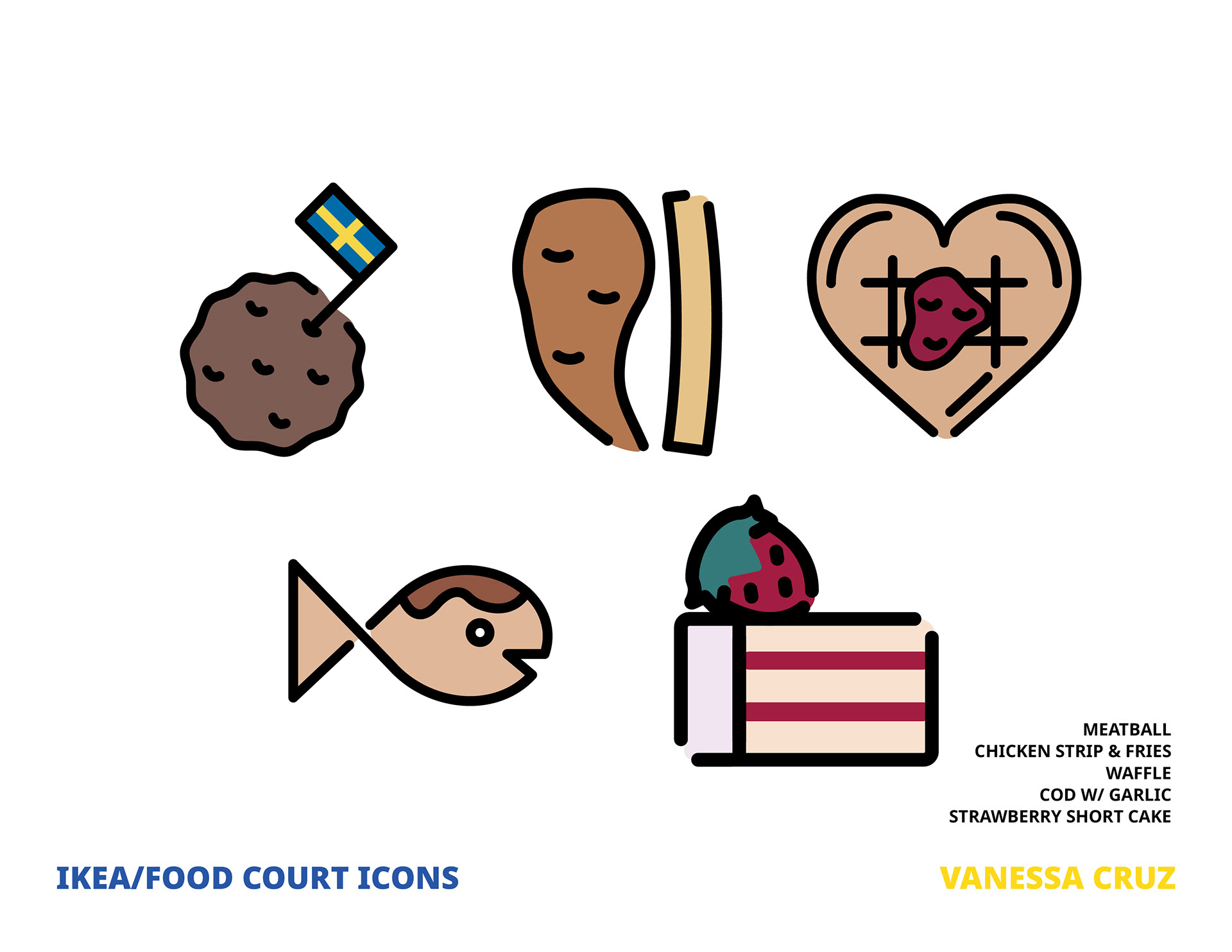
the IKEA Food Icon Project aimed to showcase the variety of offerings within IKEA's food section. From designing icons for iconic items like the meatballs to more unique offerings such as cod in garlic sauce, the goal was to highlight the diverse range of options available. Additionally, I deliberately included more complex items that may not typically be associated with icons, challenging conventional design norms and providing users with a comprehensive visual representation of IKEA's food selection. By incorporating both familiar and unexpected elements, the icons not only served a functional purpose but also added depth and character to the overall user experience.
DESIGN USAGE


PROGRAMS USED