During my professional career, I have worked on various campaigns for Mueller Sports Medicine as part of the marketing team, supplying graphics. The campaign I am most proud to have worked on is the Revive Award due to it being an impactful change to a collegiate athlete’s life. The messaging behind the campaign was to help a collegiate athlete who has overcome obstacles by giving them a life-changing opportunity.
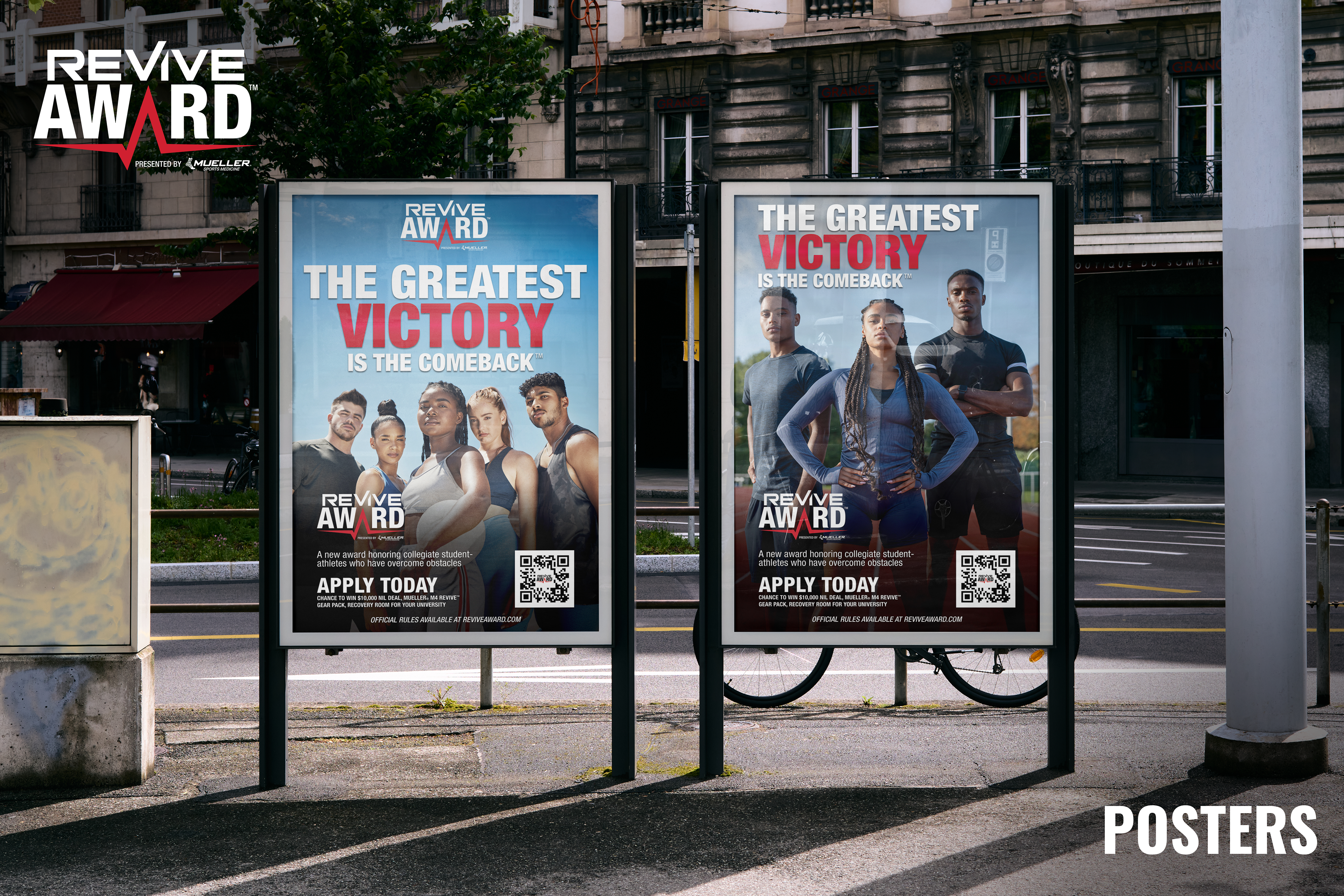
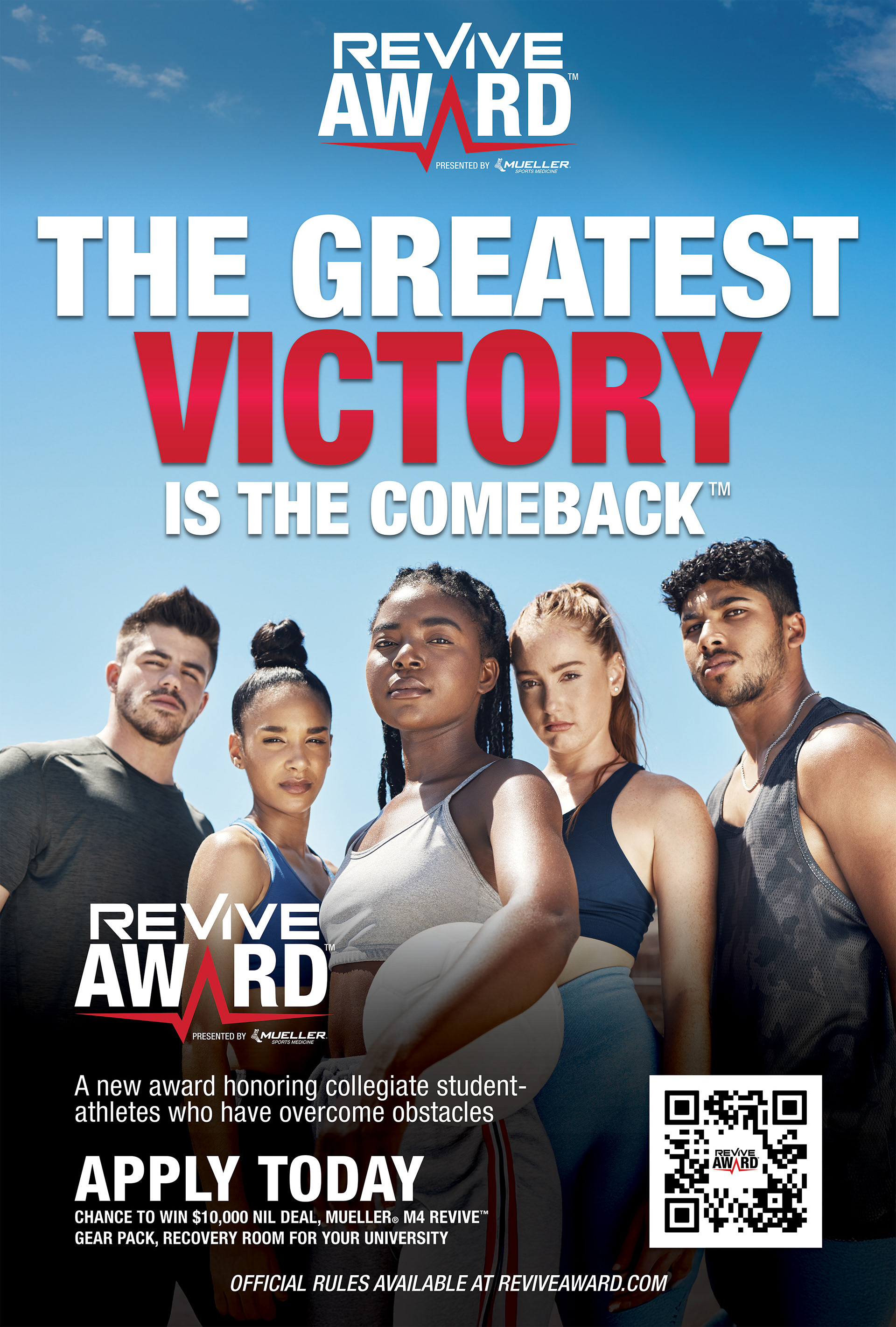
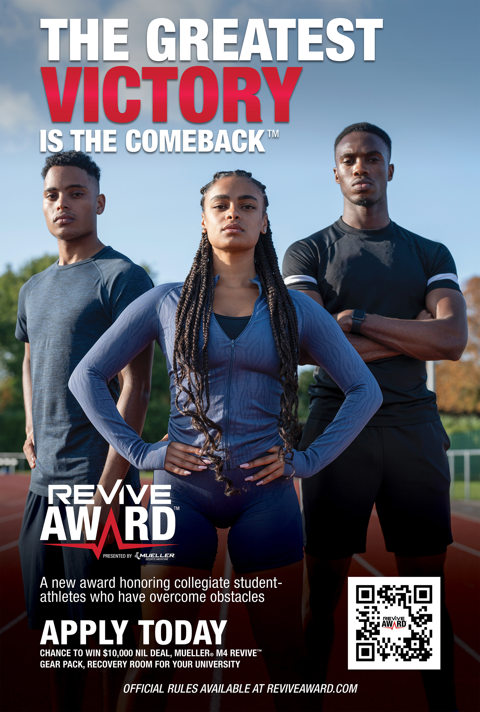
Posters
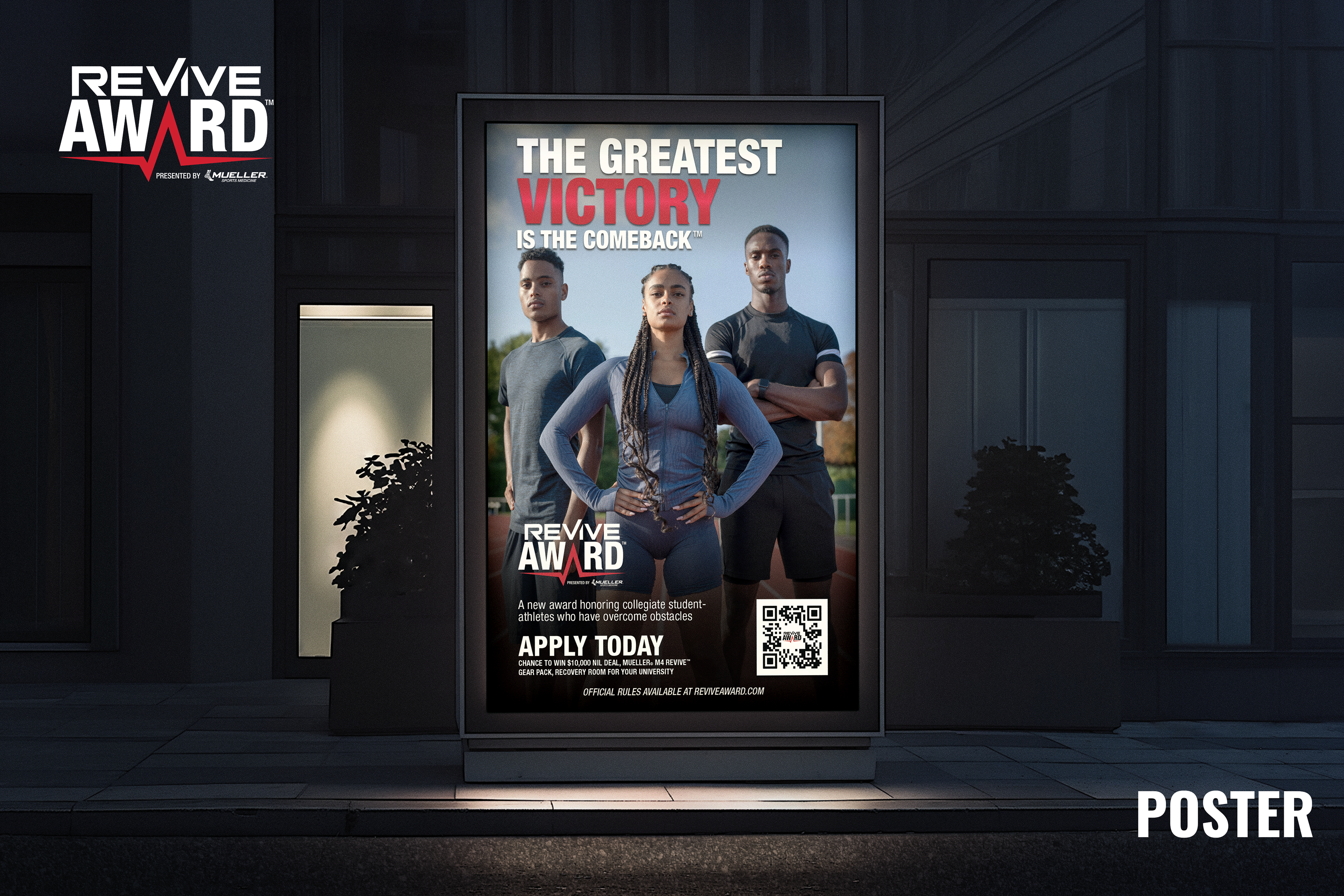
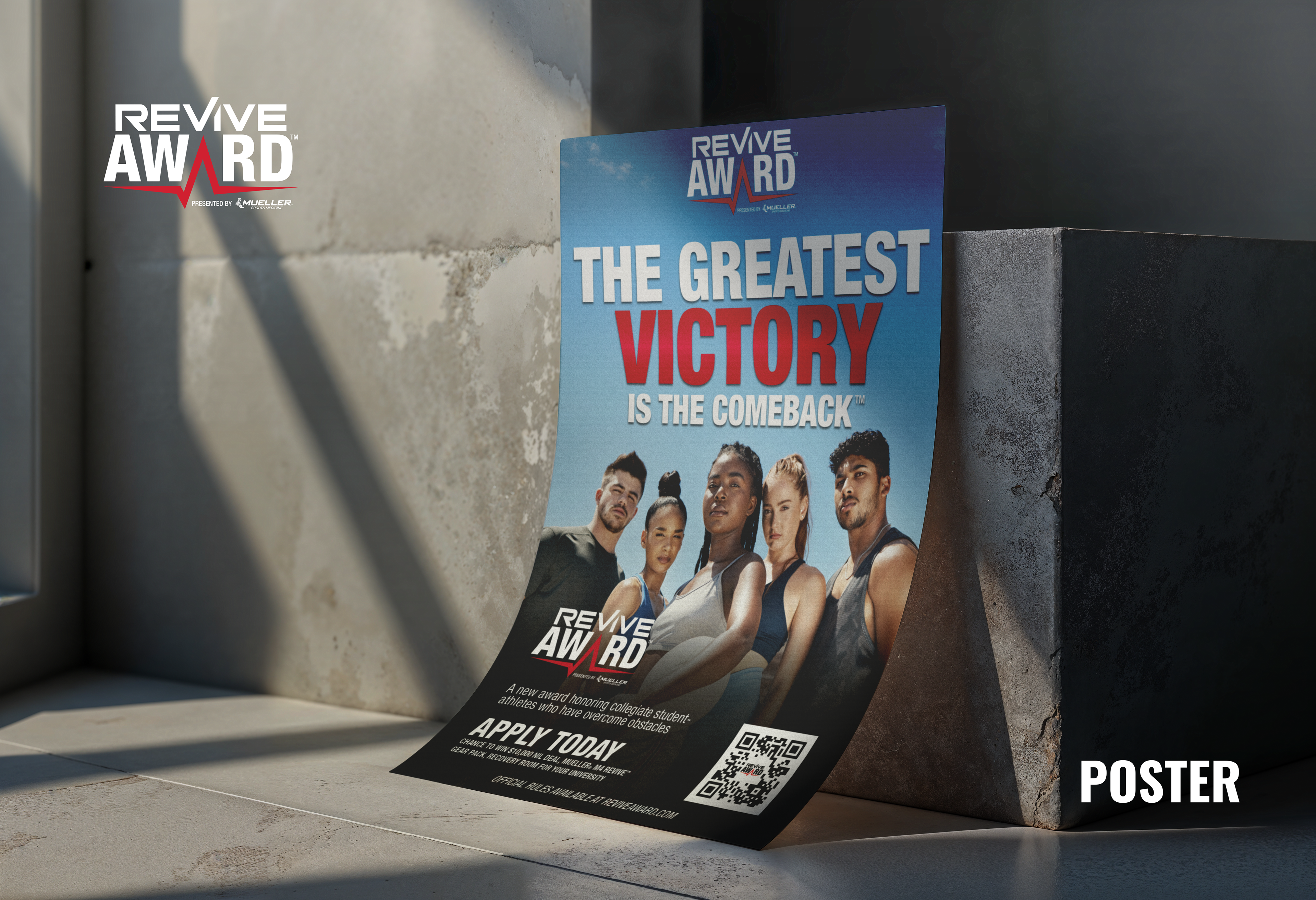
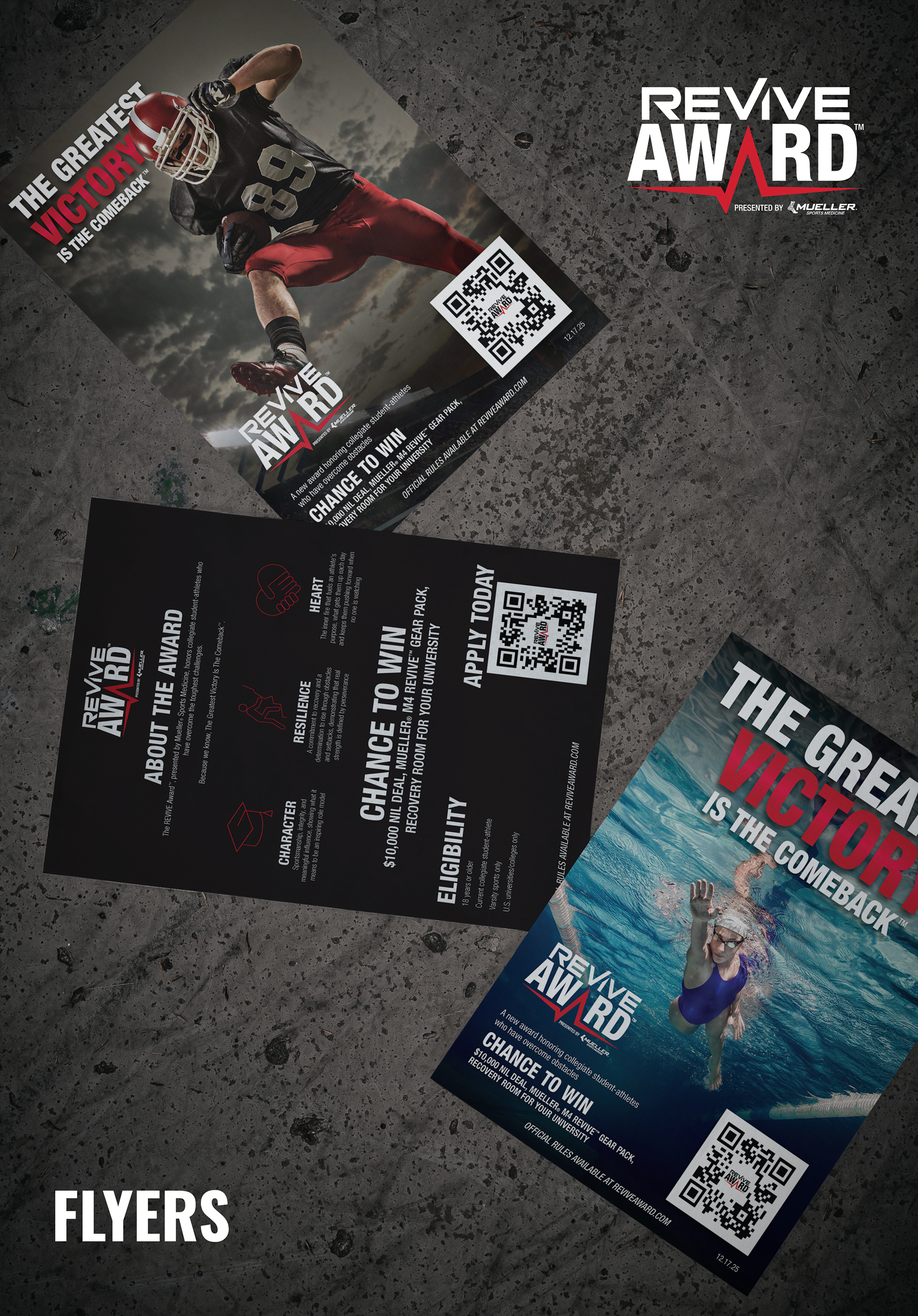
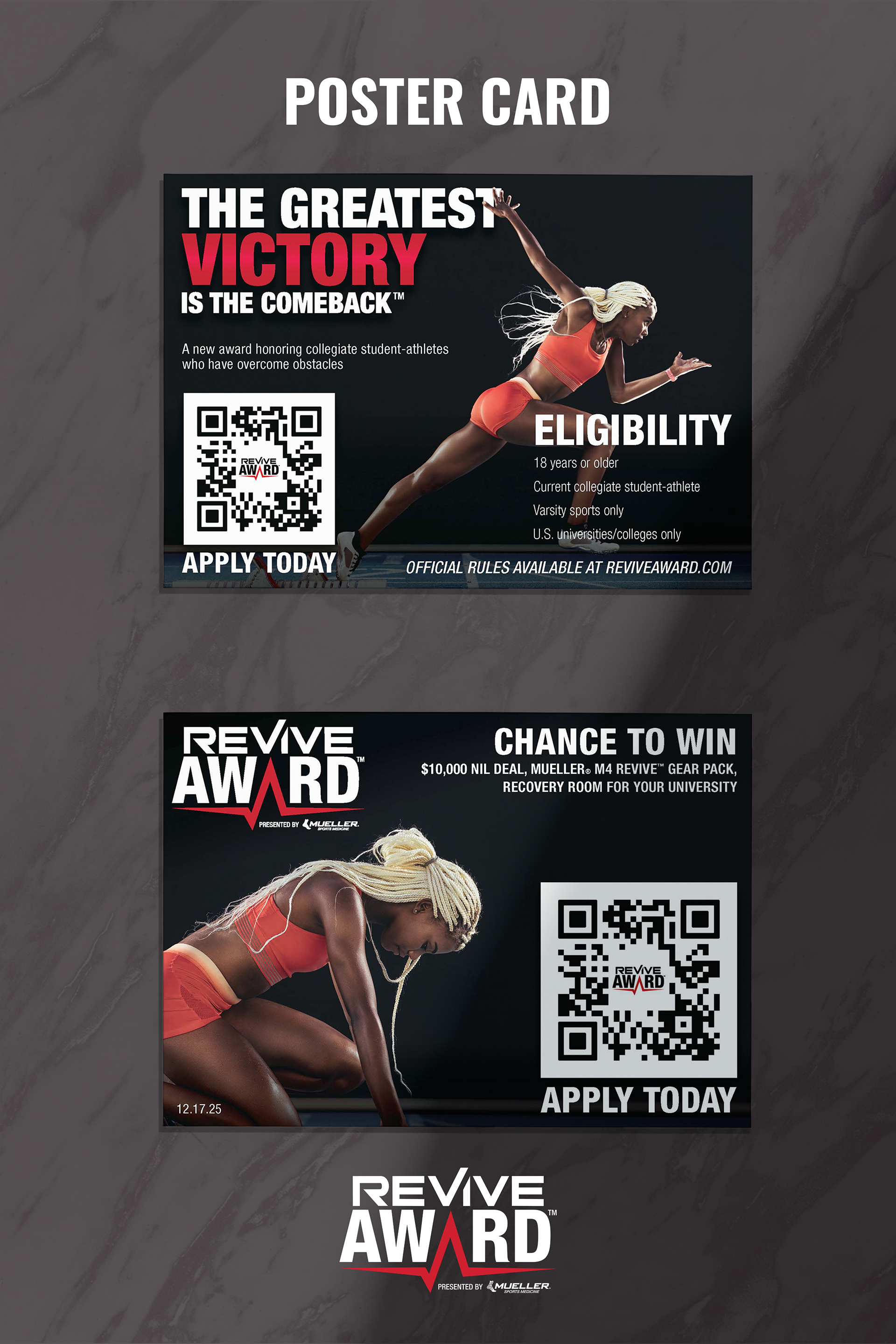
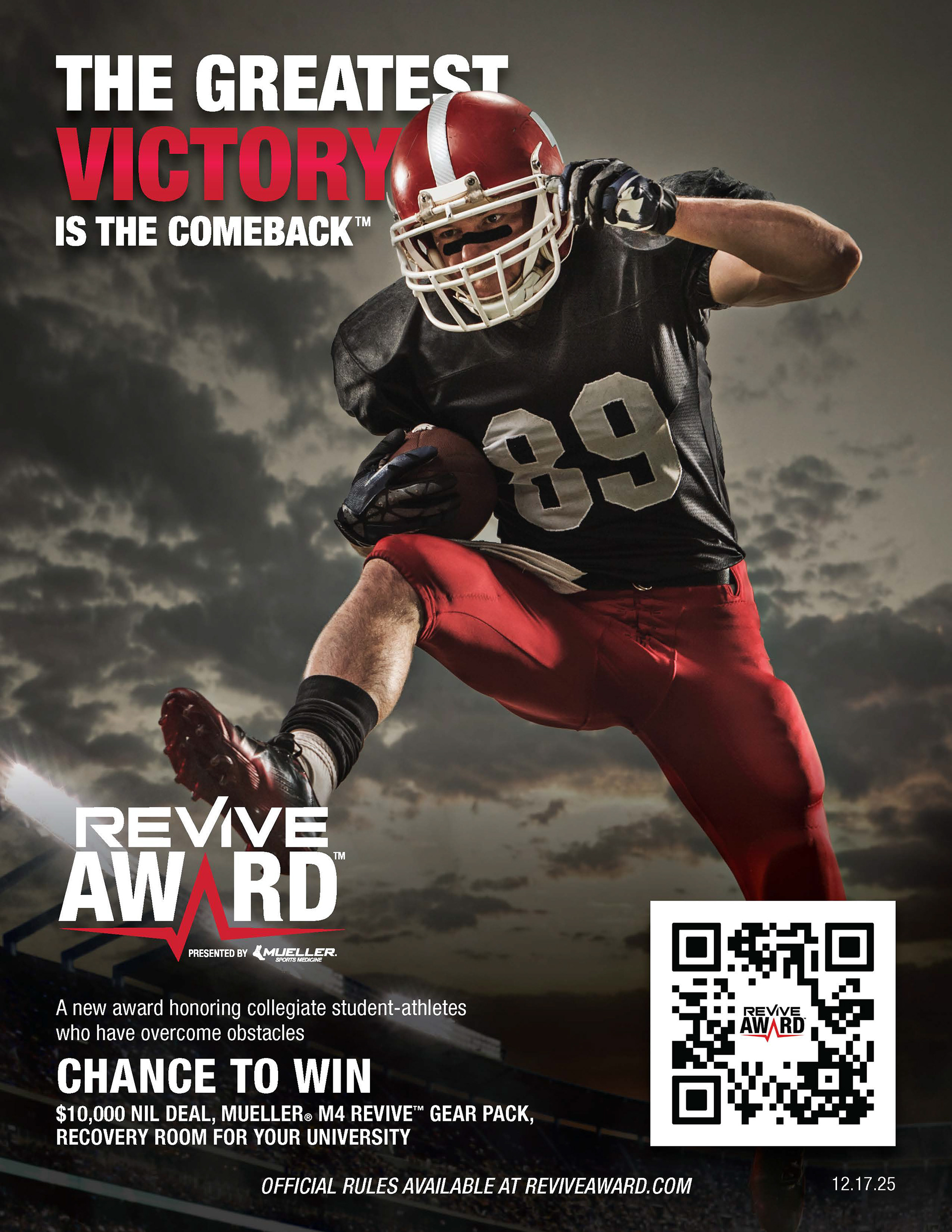
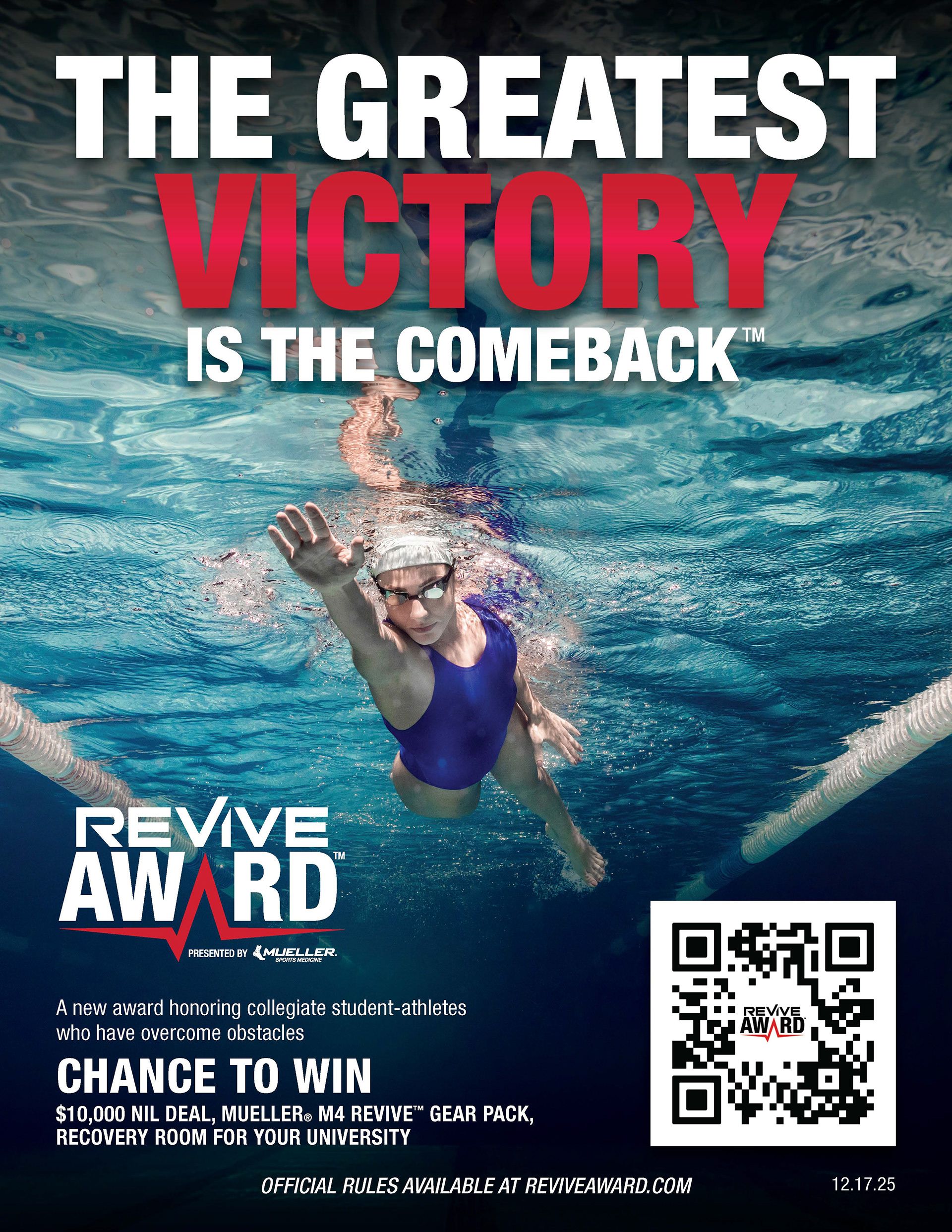
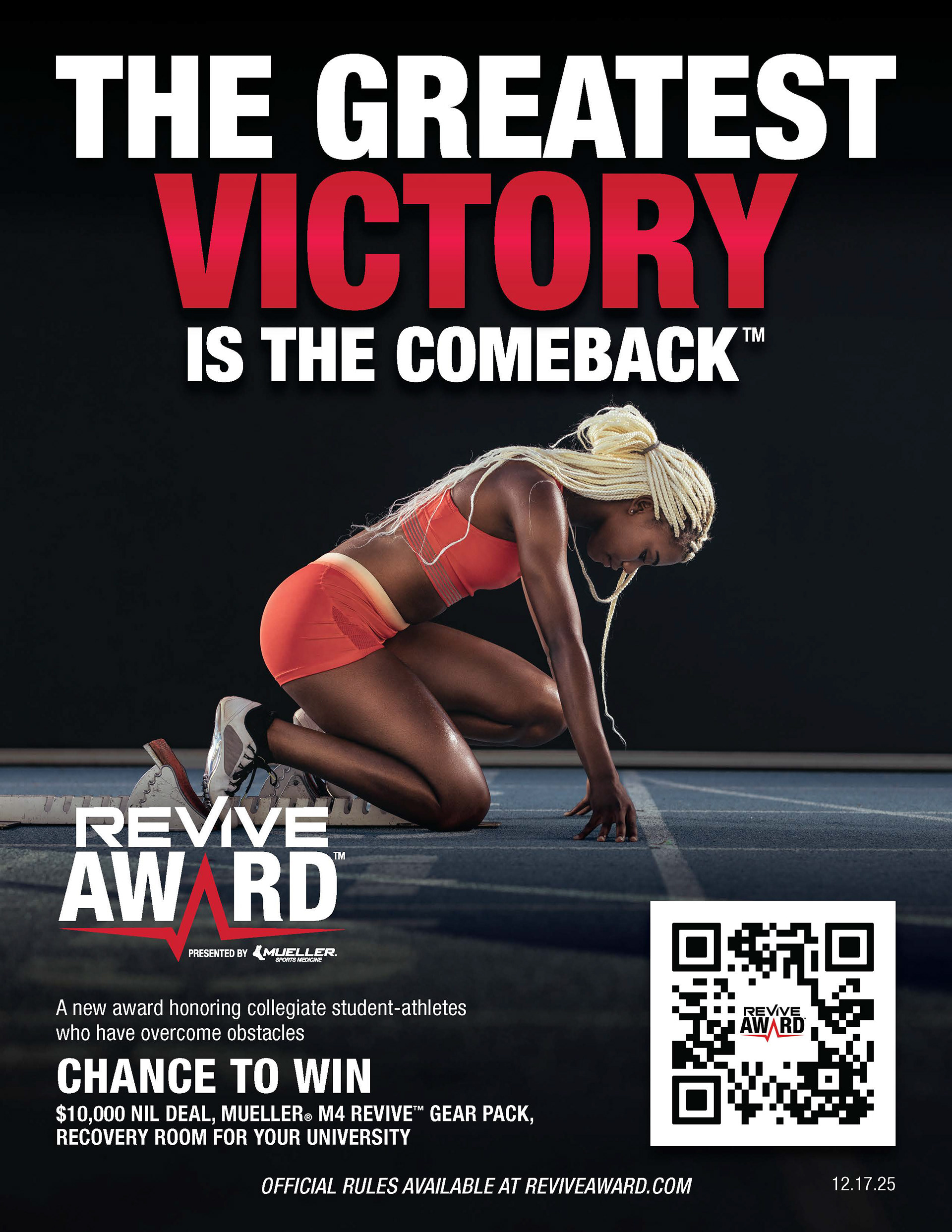
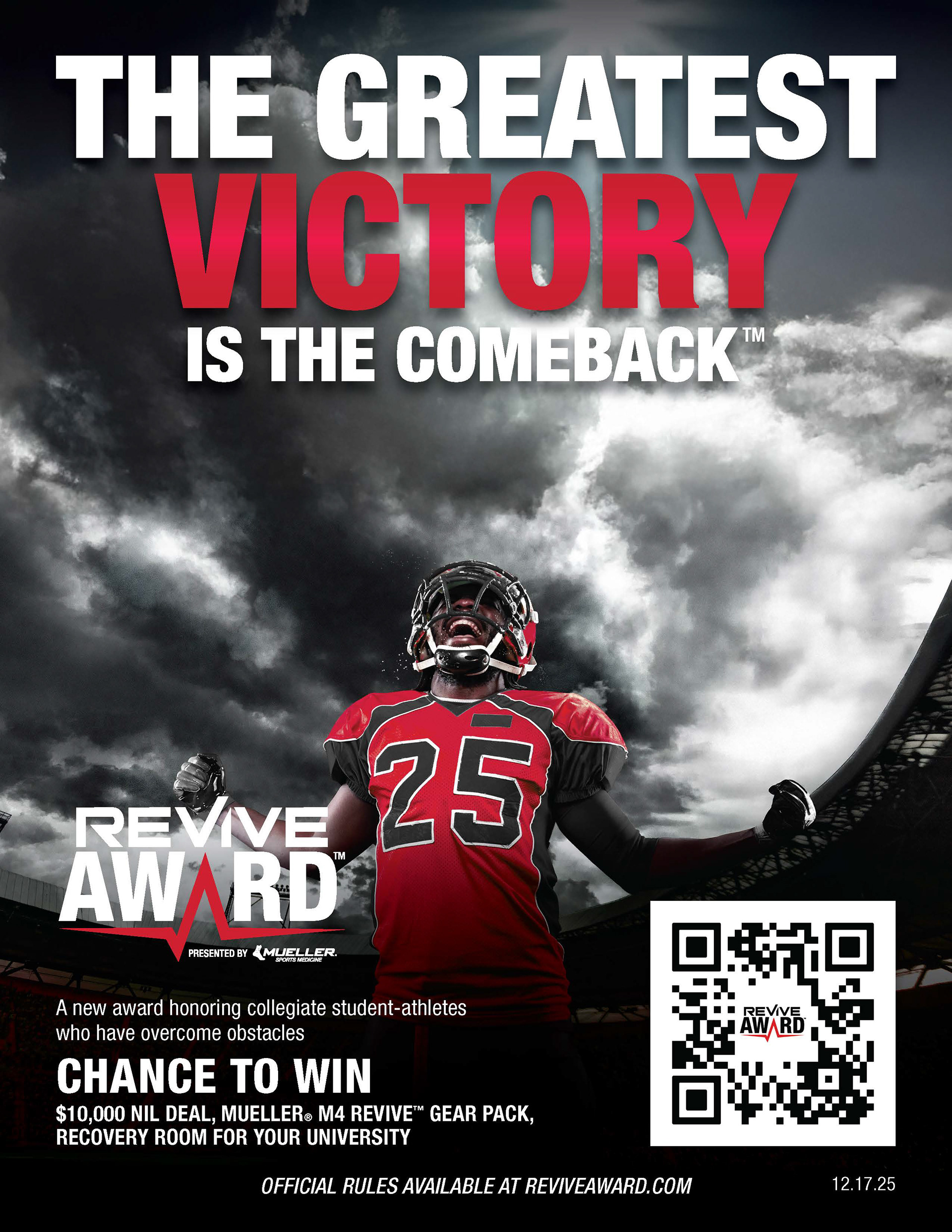
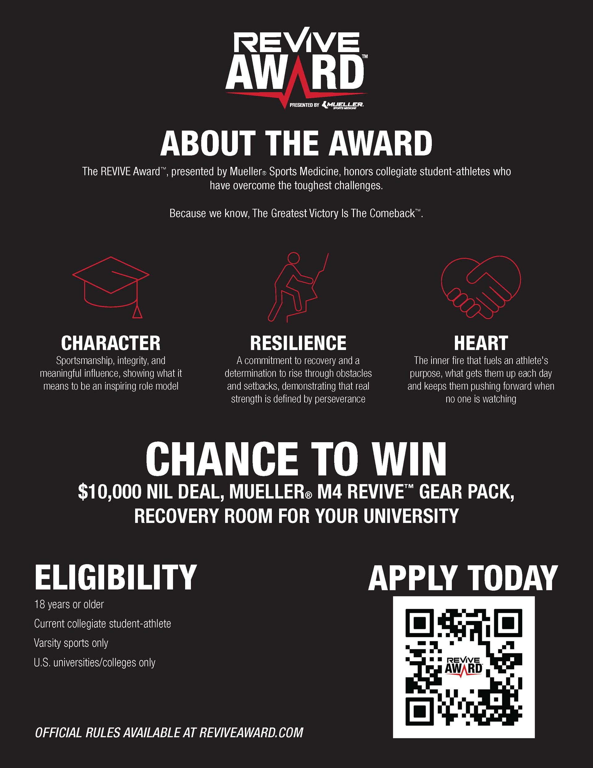
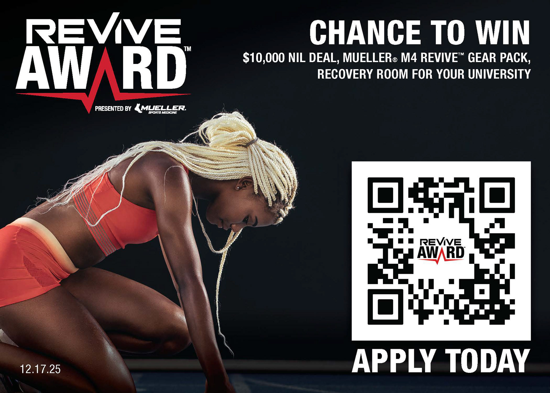
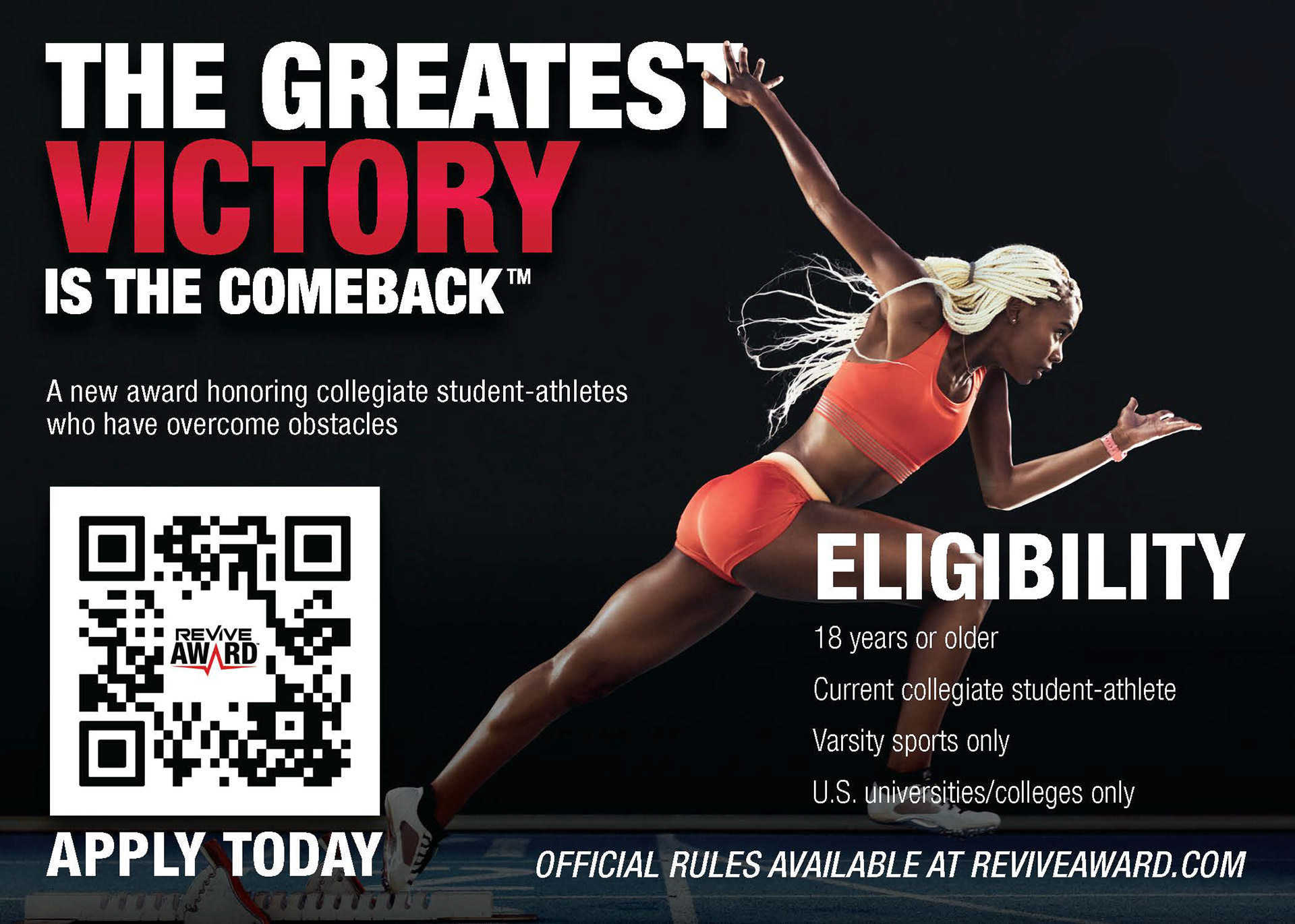
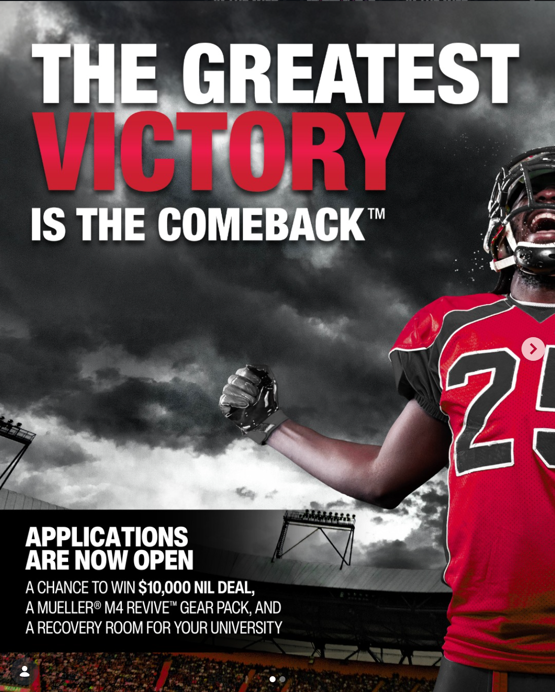
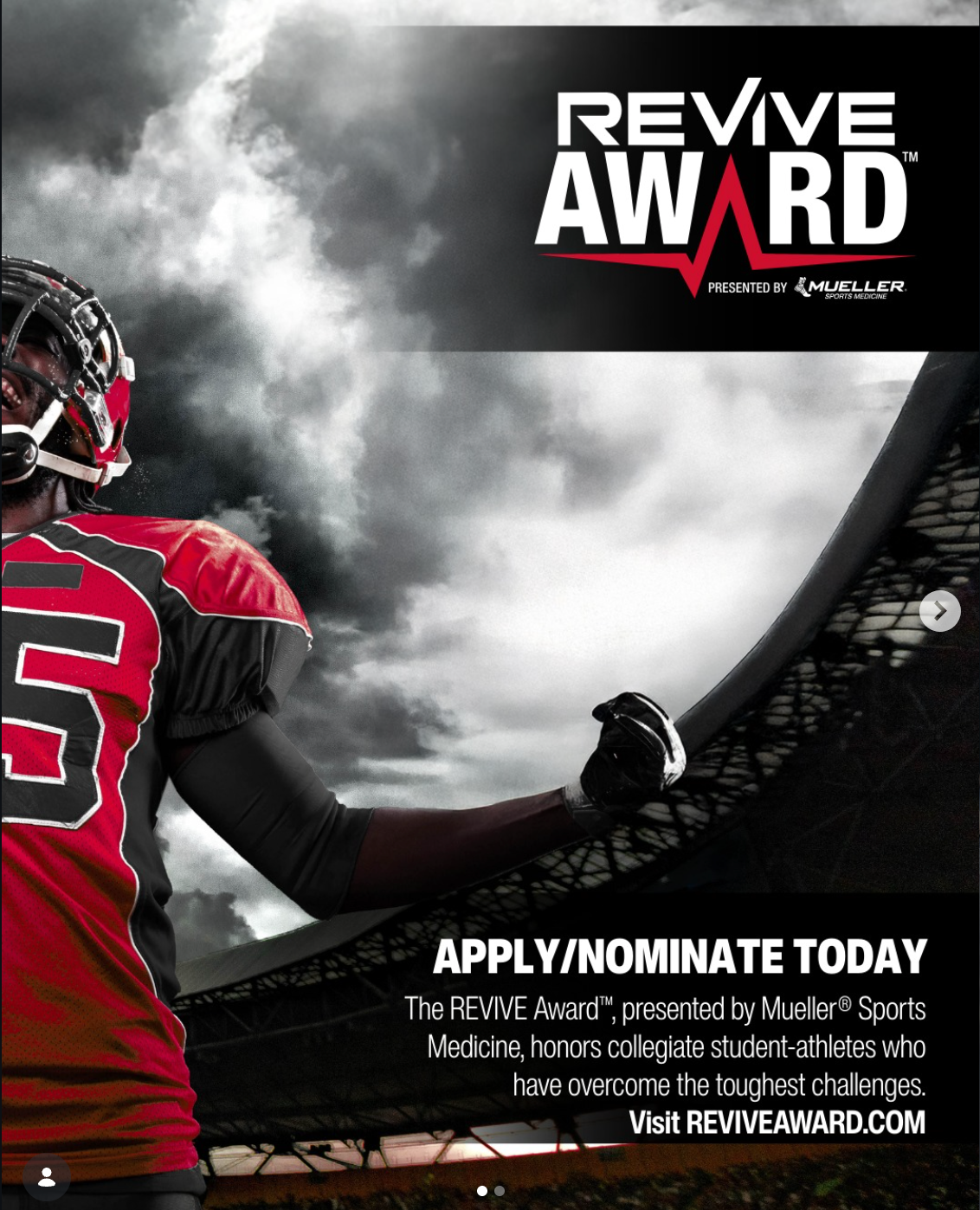
For these posters, I had to think about where they would actually live. Since this is an award for collegiate athletes, the designs needed to feel like they belonged in a training room. I focused on making them bold and clear from a distance, but still fitting the environment athletes see every day. A lot of my decisions about layout, scale, and overall look were based on making sure they felt natural in that space while still standing out.
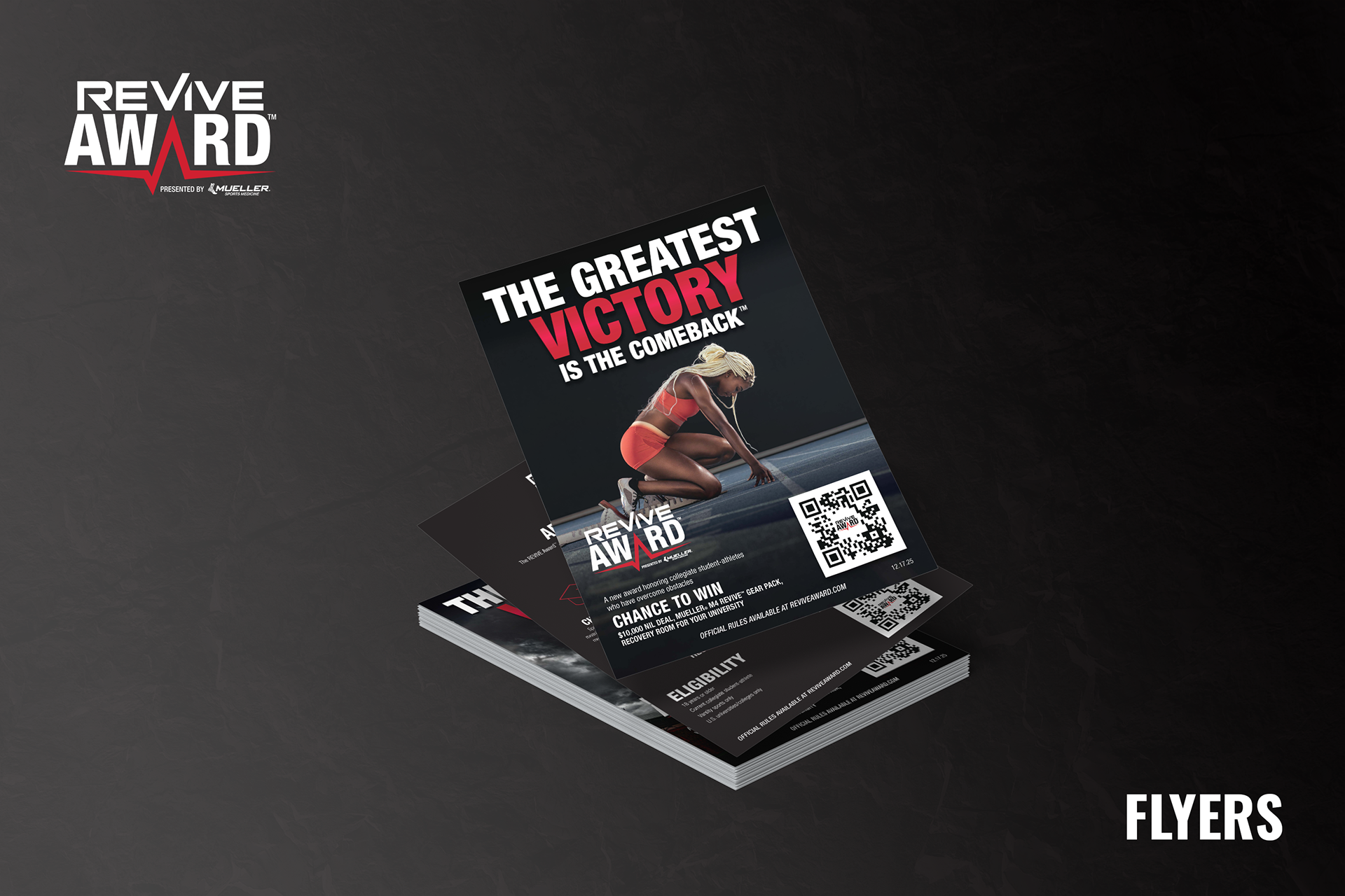
FLYERS & INFO CARDS
Drawing inspiration from the minimalist and bubbly design trends of the 2020s, I embarked on the design process for The Ordinary website with a clear vision in mind. My objective was to maintain the brand's signature simplistic style while infusing it with a fresh vibrancy to avoid any sense of blandness or dreariness. By carefully balancing minimalism with dynamic elements, I crafted a design that not only honored The Ordinary's aesthetic but also provided users with an engaging and visually appealing browsing experience.
WEBSITE WIREFRAME
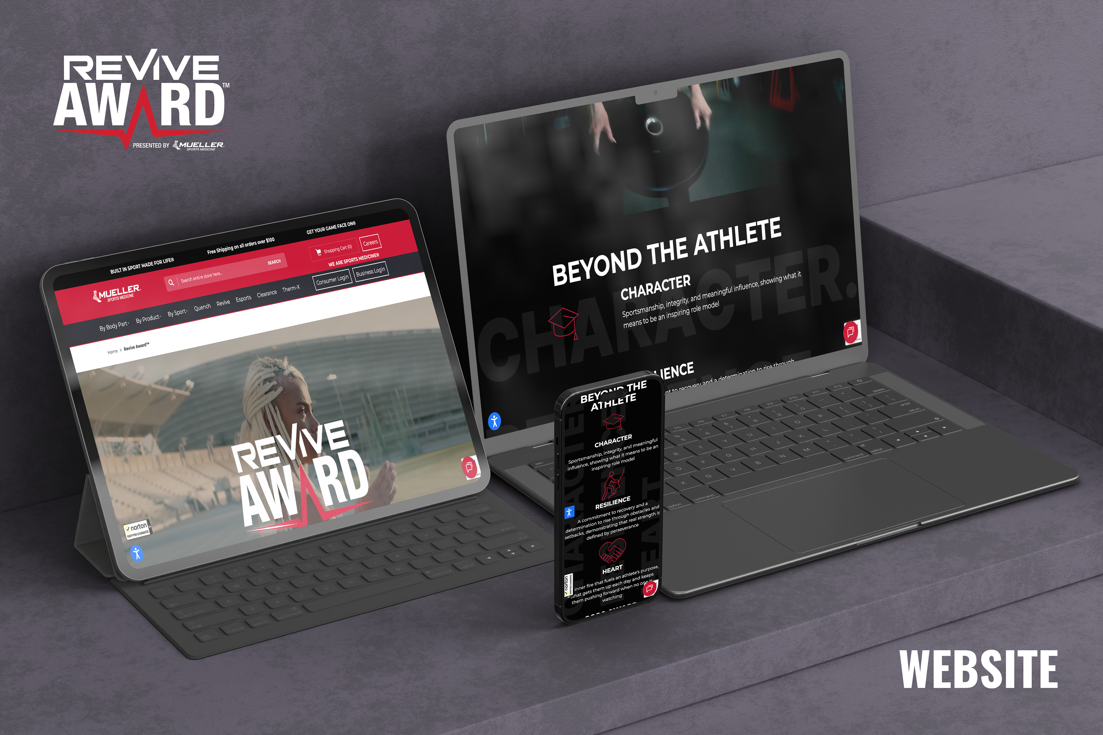
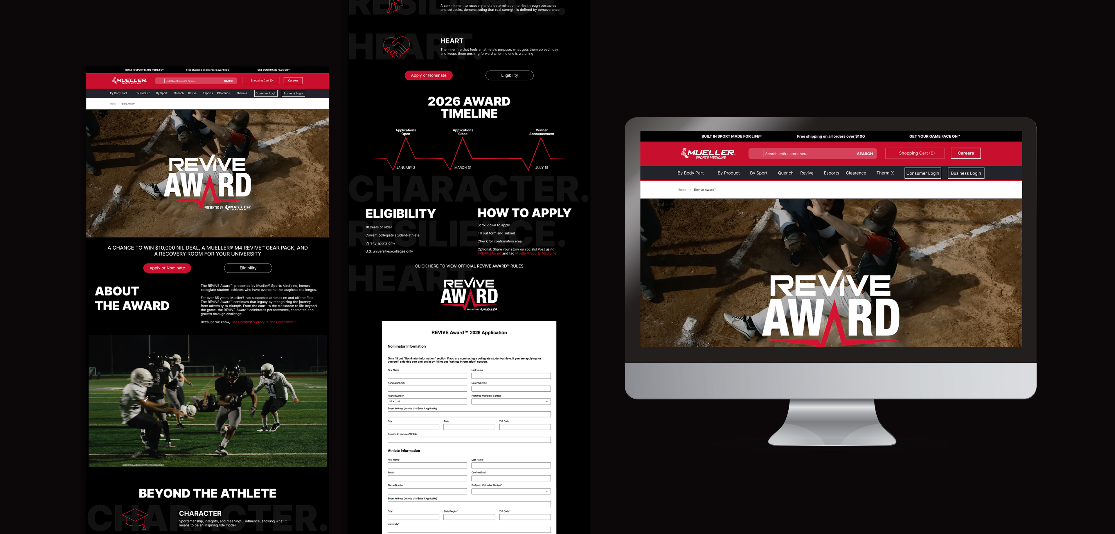
For the website wireframe, I had to really think through how people would move through the page and what they would expect to see at each step. I used UX principles and logic to plan the layout so everything felt clear and easy to navigate. I also worked directly with our development team overseas to adjust the build and make it match my design more closely. That meant reviewing HTML, giving feedback, and designing with real code limitations in mind while the site was being developed.
LOGO DESIGN
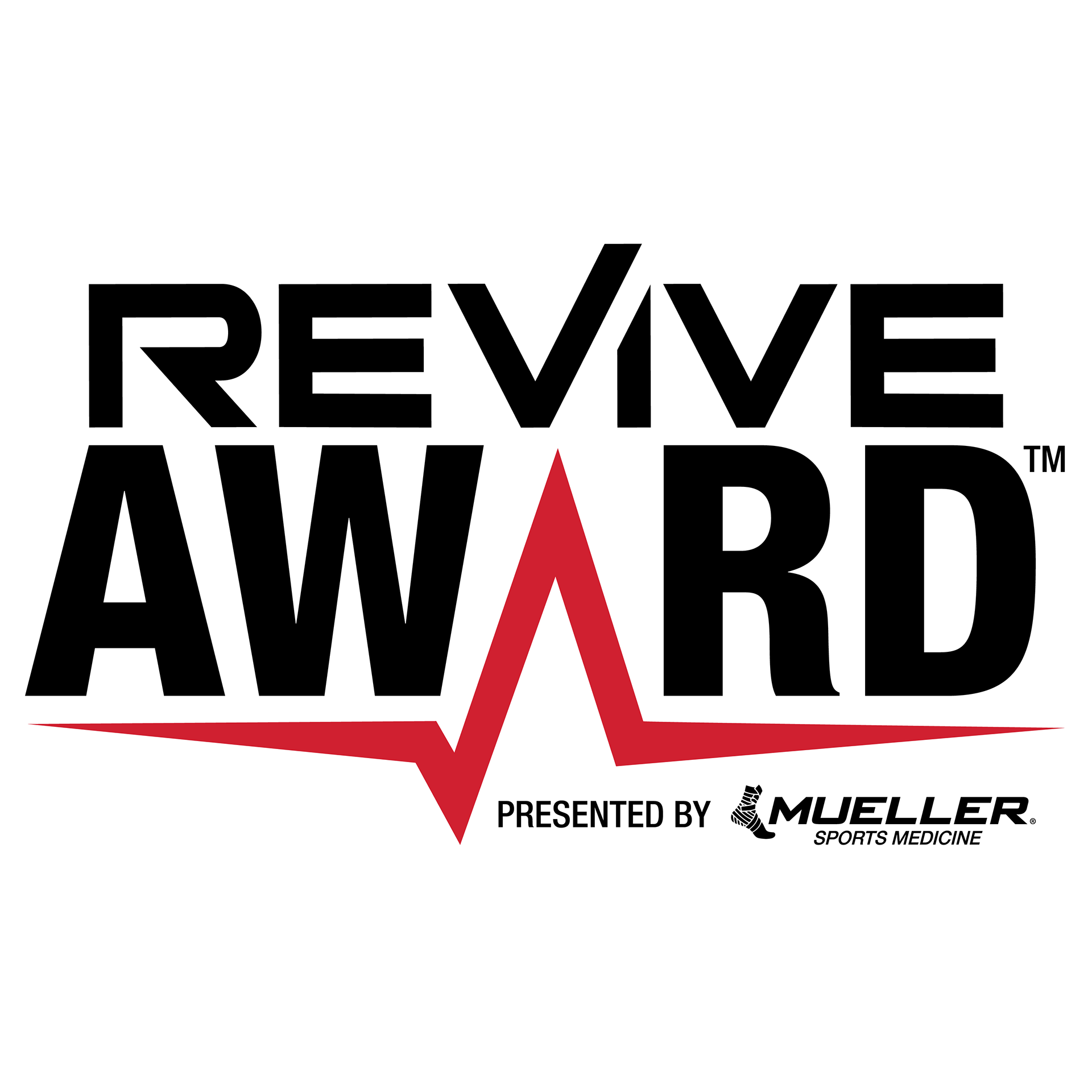
For the logo portion, I had to make sure the design visually connected to the Revive identity since the name comes directly from the product and its mission. It needed to feel like it belonged within that existing look while still standing on its own for the award. My focus was on keeping the style, tone, and overall feel aligned so everything felt cohesive and clearly tied back to what Revive represents.
EMAIL/SOCIAL MEDIA
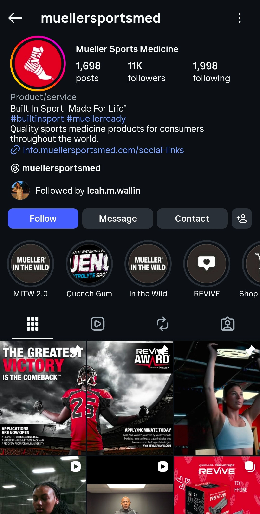
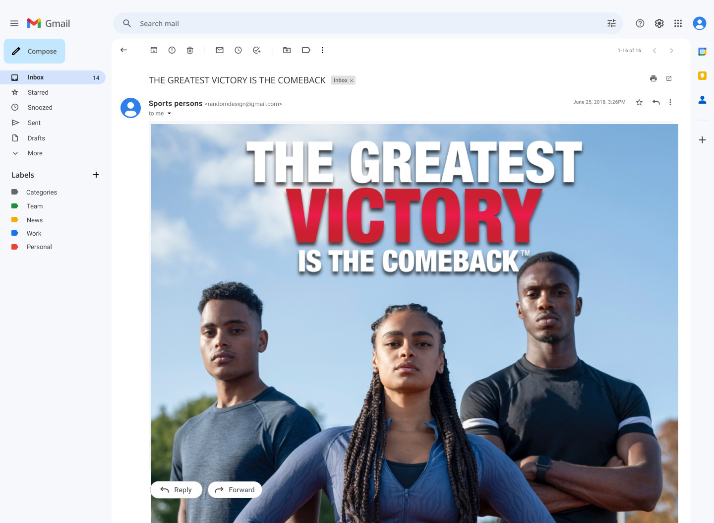
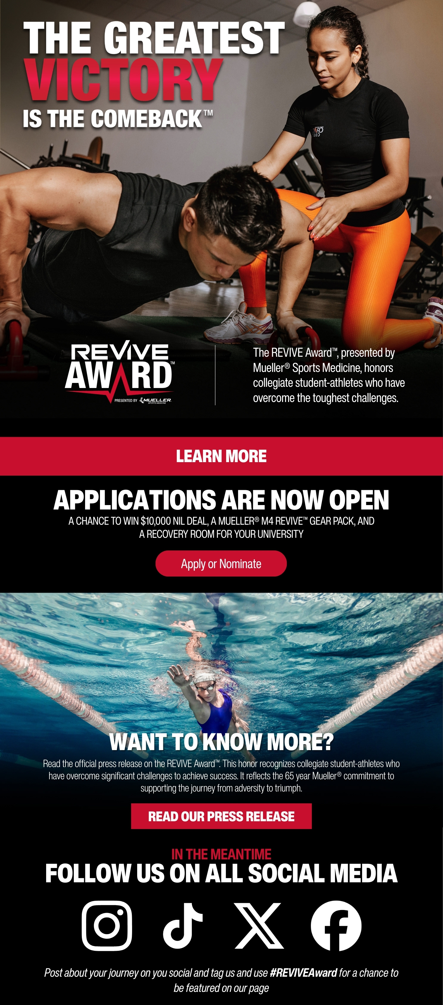
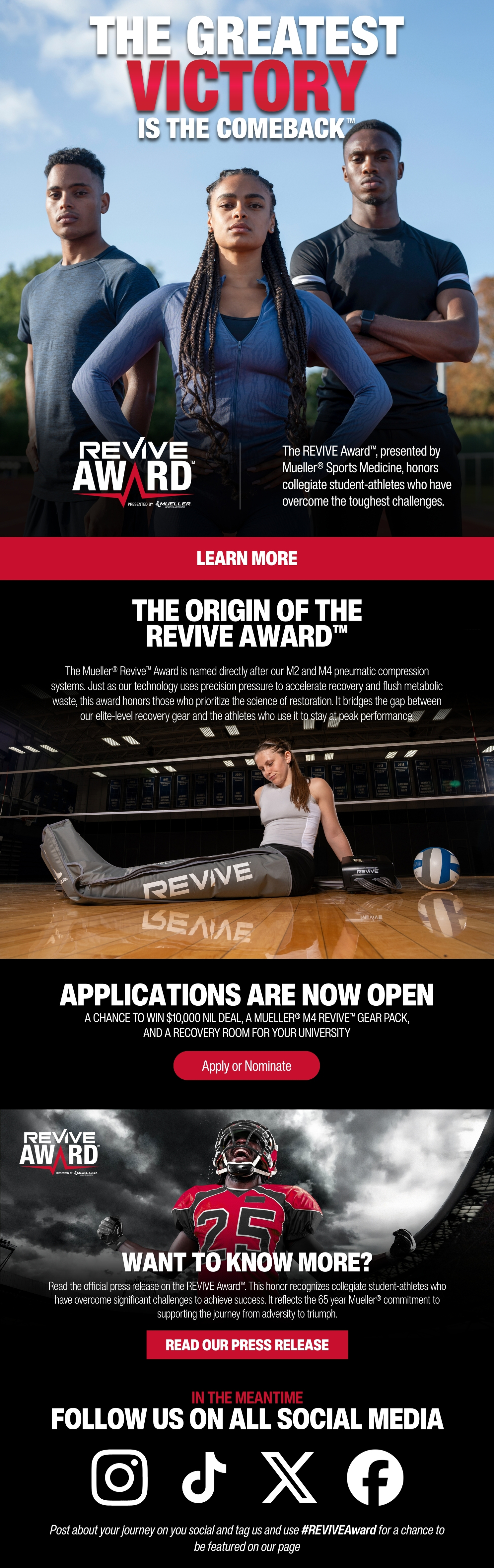
For the Revive Award email and social content, I focused on making it feel relatable to people my age. I wanted it to feel genuine and engaging without coming off overly corporate. The goal was to make something that would catch attention quickly, feel real, and clearly communicate the meaning behind the award.
PROGRAMS USED


This campaign means a lot to me because I was so deeply involved in bringing it to life. I had the opportunity to work very closely on this campaign and lead the majority of its graphic development, which made the experience incredibly personal. From collaborating with the marketing team to working with the developers who built our site, I was involved in every moment. It came with intense deadlines and plenty of challenges, but seeing the final result made every moment worth it.
I’m proud of what we accomplished as a team and proud to have helped turn a dream into something real that can help people in need.