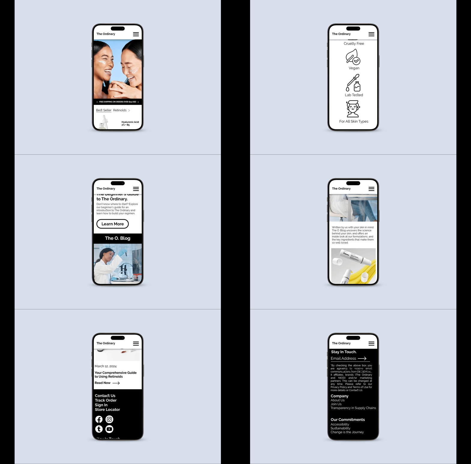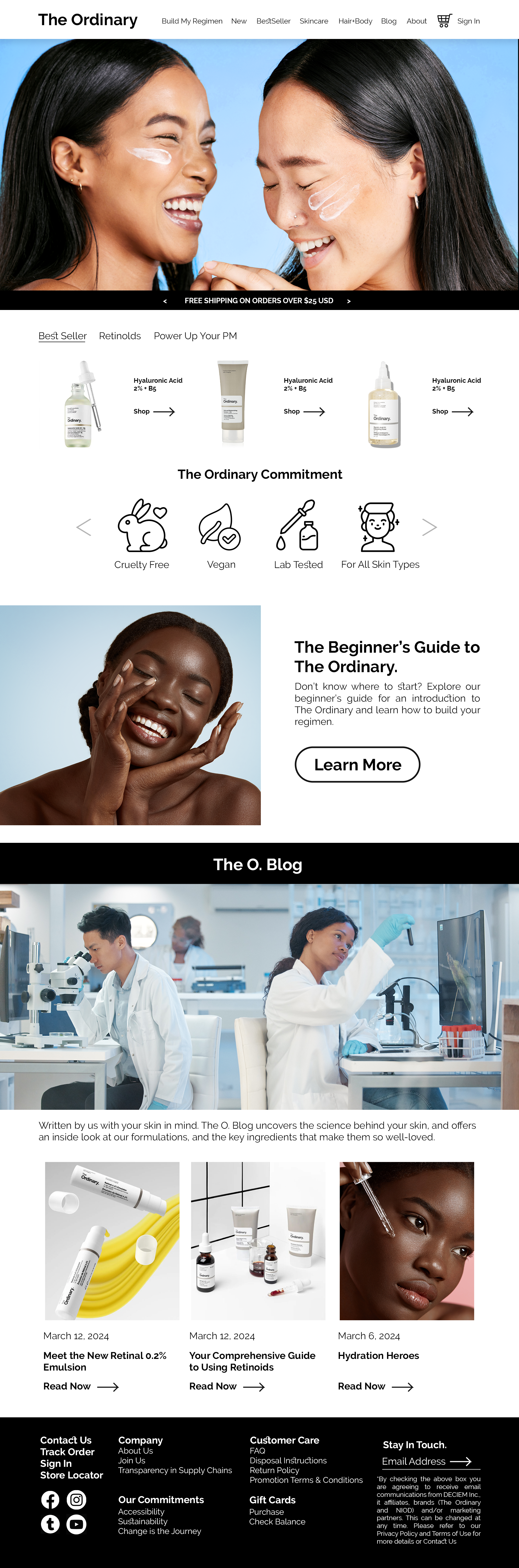
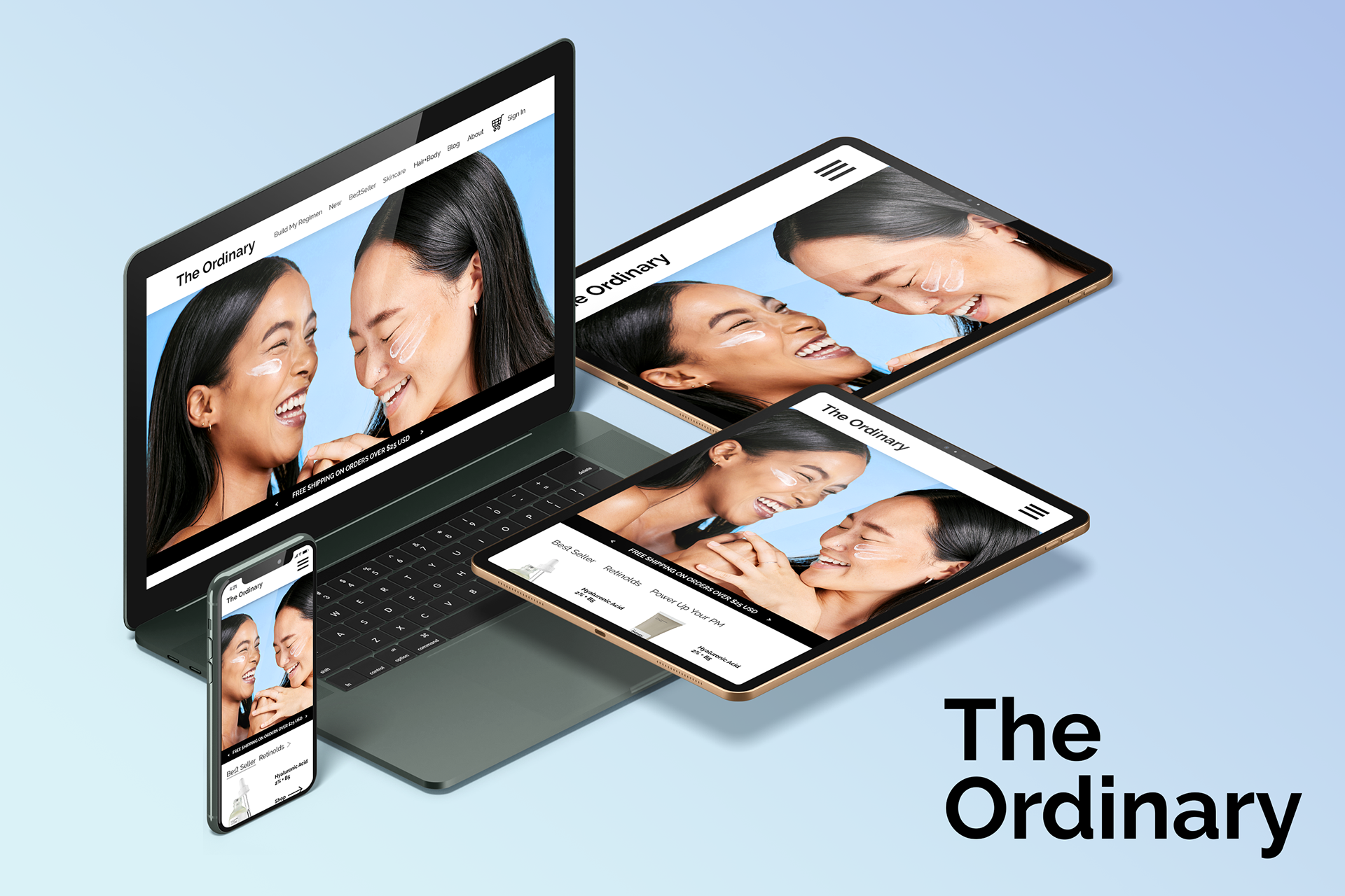
This project was created for a class I took called Advanced Design, where we were assigned to redesign a website for an existing brand. The goal was to rethink the overall user experience and visual direction while keeping the brand’s core identity in mind. It challenged me to analyze what was not working in the original site and propose a stronger, more modern solution through layout, hierarchy, and overall structure.
DEVELOPMENT
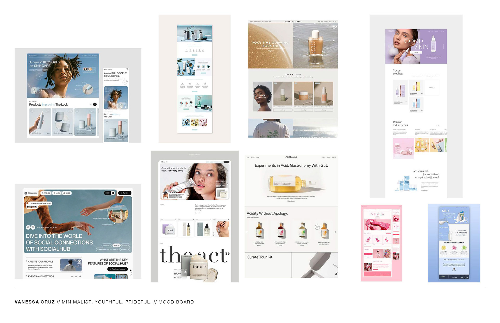
For the development, I took inspiration from other minimalist websites that had a similar tone to the original but felt more updated. I wanted to keep that clean and simple foundation while giving it a bit of new life through stronger color use and more intentional layout choices. The goal was to introduce more visual interest without losing that sterile, refined feel. It was about finding a balance between modern and minimal while still keeping the design controlled and cohesive.
WIREFRAME
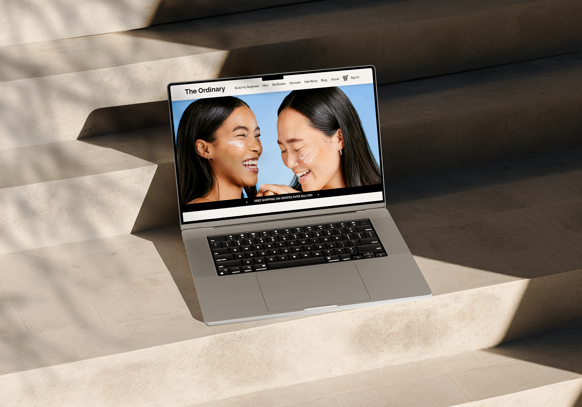
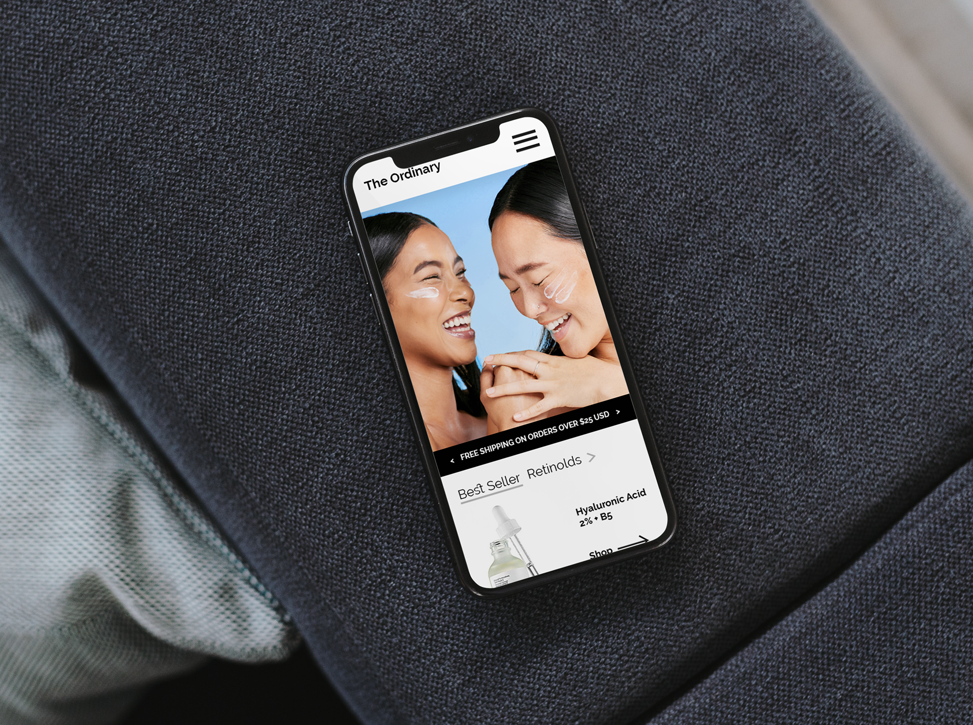
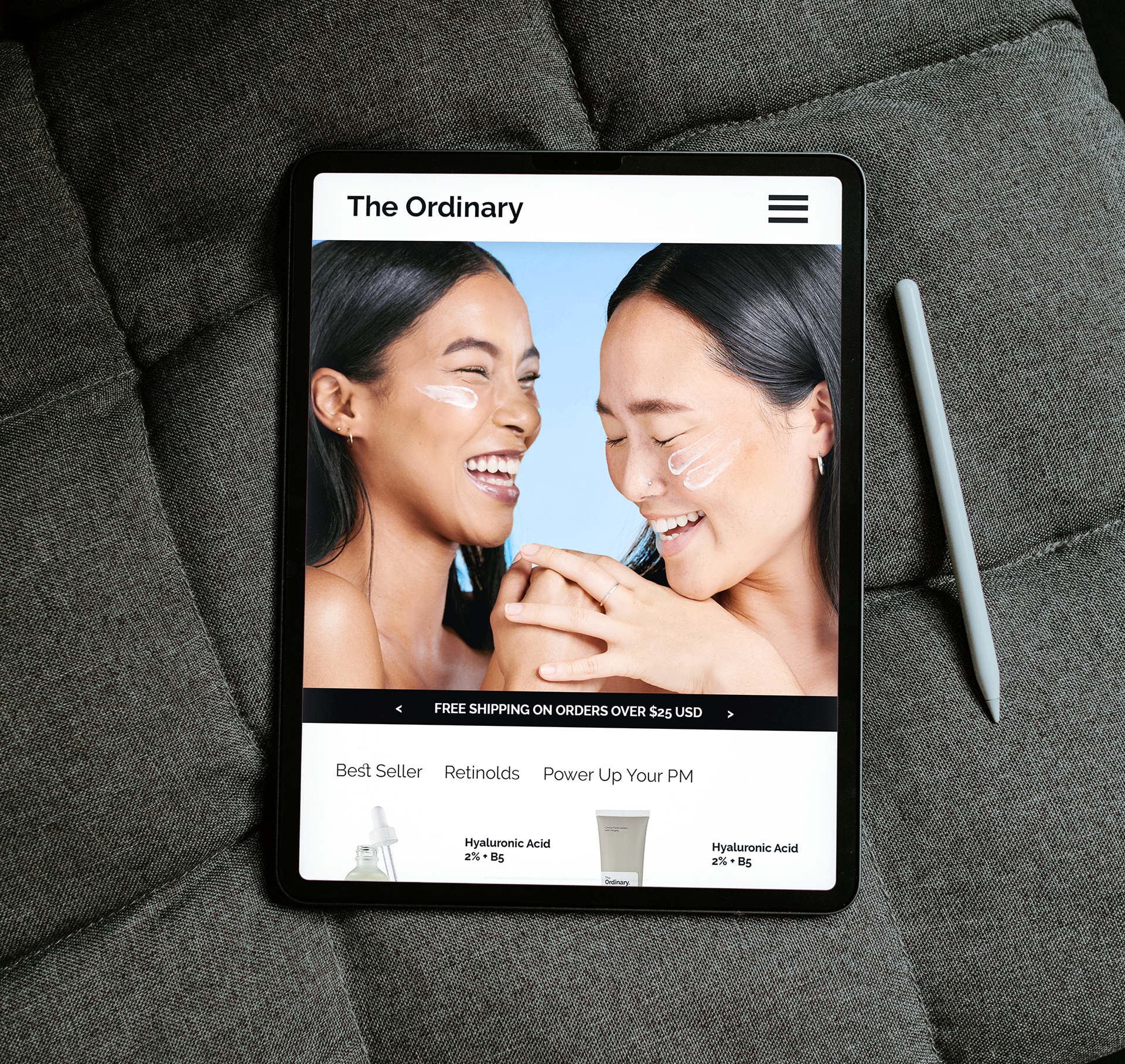
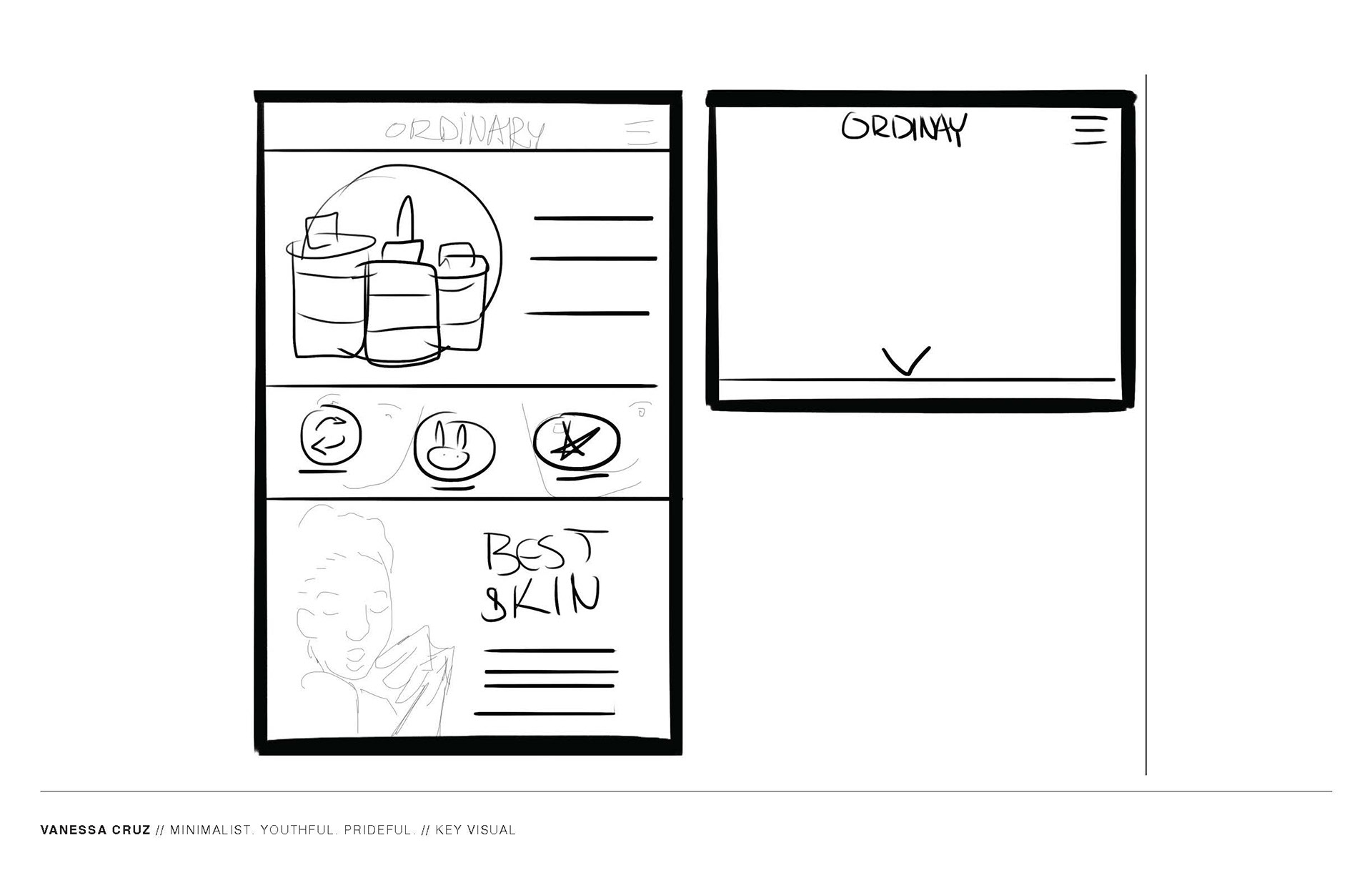
For the wireframe, I built everything out in Figma and spent a lot of time planning the structure before anything was finalized. I really thought through how someone would actually move through the landing page and what they would naturally look for first when shopping. A lot of the process was psychological, thinking about attention, flow, and decision making so the layout would feel intuitive and easy to navigate. It was something I put a lot of time into refining to make sure the experience made sense from the user’s point of view.